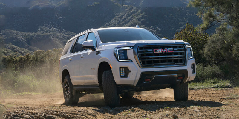
Android Automotive, Google's operating system for cars, has historically been pretty niche, and only a handful of high-profile cars like the Polestar 2 have used it. Now, though, Android Automotive is going mainstream, and we're starting to see some of the biggest car manufacturers roll out Google's operating system across entire lineups.
Today, we're looking at the 2022 GMC Yukon, but really, this is General Motors' Android Automotive system, and you'll see it rolled out across most of GM's lineup in the future. The same basic setup powers the Hummer EV1, and with all of the parts-sharing that goes on at GM, expect to see this system pop up in Chevys, GMCs, Cadillacs, and Buicks. With Ford and Honda jumping into the Android Automotive ecosystem in the near future, Google's car OS will soon be everywhere.
Let's get the usual disclaimer out of the way: This article is not about Android Auto, Google's tethered phone app and competitor to Apple's CarPlay. Android Automotive, fully spelled out (it's sometimes branded as "Google Built-In"), means the car is one big Android device. A computer runs the car's infotainment system, and that computer runs Android. Even if you have an iPhone in your pocket, that won't change the OS your car runs (it does support CarPlay, though). For most models, buying General Motors will mean buying an Android Car. You'll see an on-screen message pop up during setup saying, "By using this car, you agree to Google's terms of service."
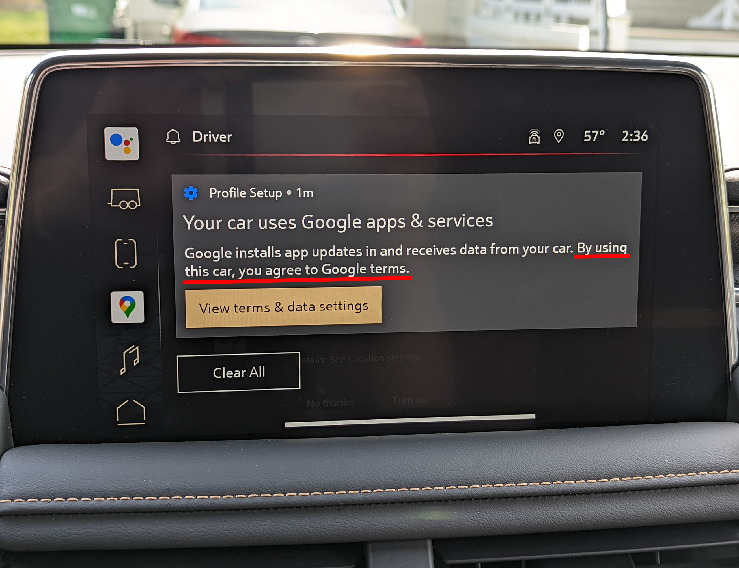 This is one of the first screens the car shows from a fresh reset. If you don't want to agree to Google's terms of service, call an Uber.Ron Amadeo
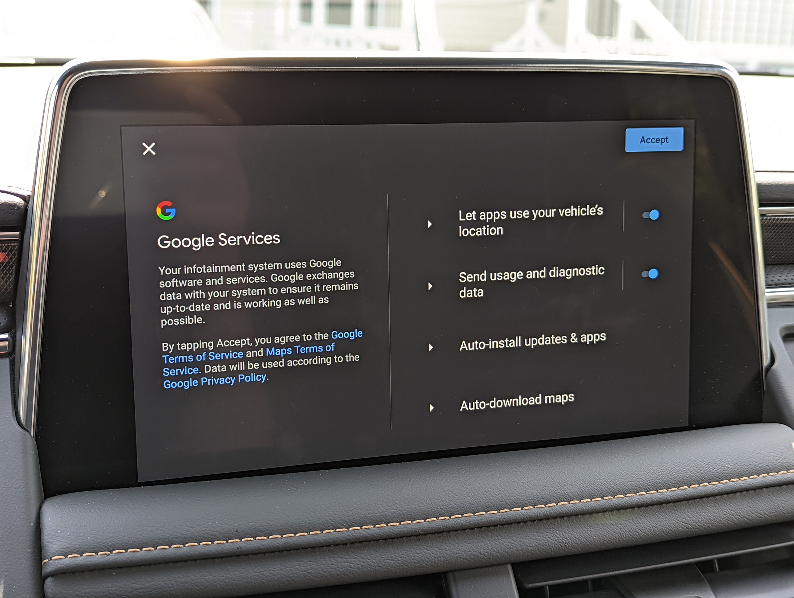 You don't get much in the way of privacy options. You'd probably never block apps like Google Maps from using your location.Ron Amadeo
The idea here makes some sort of sense. Consumers want their car infotainment system to look and work more like a smartphone does, so why not just load the vehicle with a smartphone OS? Then you can get all the smooth-scrolling, touchscreen-based swipe navigation that people have come to expect from a modern computer. Android Automotive is a Google-blessed OS, and like phone companies, manufacturers like Ford, GM, and Volvo sign deals with Google to license the OS and a slew of Google apps. This car has onboard Google Maps, probably the biggest killer app in the automotive industry. You also get Google Assistant voice commands and the Google Play Store for cars, allowing easy access to apps like Spotify and other media players.
The hardware: Four screens, three operating systems
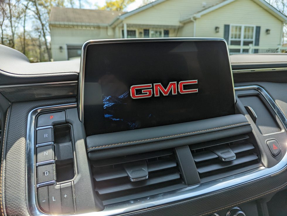
Reviewing a car computer is a strange proposition because the hardware is always so old. Car development takes around five years, and when the cars finally get to market, the computer hardware isn't that exciting. The hardware for our Android Car system—which is internally called "General Motors Infotainment 3.7," or "gminfo37"—is a 5-year-old Intel Atom A3960 SoC with an Intel HD Graphics 500 GPU, 6GB of RAM, and 64GB of flash storage.
This is not uniquely a GM problem, and the same CPU exists in the Polestar 2—though that system has only 4GB of RAM—so we'll classify both cars as "first-generation Android Automotive hardware." The age of the hardware is notable, though. Android Automotive doesn't let you sideload apps into a production car, but look up Atom A3960 Geekbench scores, and you'll see that the computer in this $78,000 vehicle is barely faster than a $35 Raspberry Pi 4. The GMC Yukon and Polestar 2 both feature one of the slowest CPUs you can buy today in any form factor.
I'm sure the Atom A3960 went through a lengthy certification process to ensure it can survive the heat and vibration of a tough car environment, but it's disappointing to see GMC shipping what are basically budget PC parts from 2016. Even if the five-year hardware delay is unavoidable, the company could have started with mid-range or high-end 2016 Intel hardware rather than cheap Atom parts.
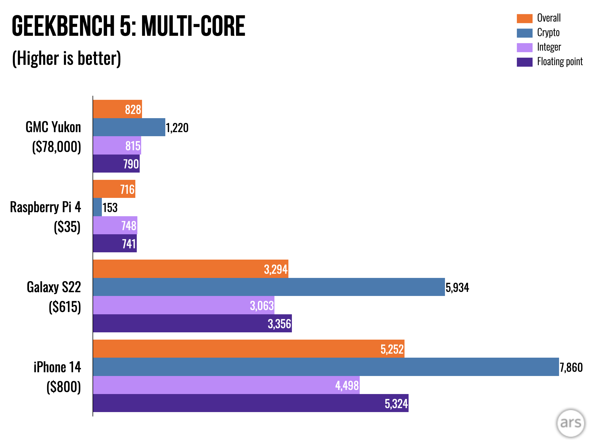 If car companies want a smartphone-like experience in a car, they should start with smartphone-like hardware, instead of... whatever this is.
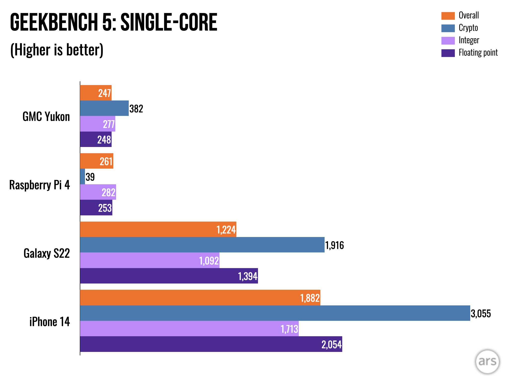
These cars run on either gasoline or a huge battery, so it's not like CPU power usage is a problem. Cars are already full of fans, so cooling shouldn't be an issue, either. When the whole point of projects like this is to "make the car work like a smartphone," modern smartphone-class hardware would help companies reach that goal.
As for the other hardware, you get a generous 64GB of storage, which you probably couldn't fill even if you installed every app in the (very limited) Automotive Play Store. Packing in lots of storage is good car computer design, though. Cars last longer than phones and tablets, and that 64GB of storage will help with the car computer's longevity. The eMMC flash storage isn't very long-lasting, but Android Automotive has a significant "Flash Wear Management" system geared for a 10-year-plus life cycle. Providing a bigger storage bank allows for better wear leveling and gives the system wiggle room to flag dead blocks of storage, reduce the overall storage amount, and keep on trucking.
Google says that if you're streaming music, caching the incoming bits can end up writing 50MB of data to the eMMC every minute, so even if you aren't constantly installing apps, flash wear is a major concern. Google says that with 16GB in daily writes and 16GB of free space, you would have total storage death in 10 years (and storage problems earlier than that). The Yukon ships with around 38GB of free space, so you should be fine for a while.
Some Android Automotive vehicles can even be equipped with an SD slot (I did not spot one in the Yukon), which Android will format as permanent "adoptable" storage that is expected to be left in the system. On supported systems, Android Automotive would then move many of these daily activity writes to the SD card, and when the SD card eMMC dies, you just throw it out and insert a new one, saving your permanent car storage from flash wear.
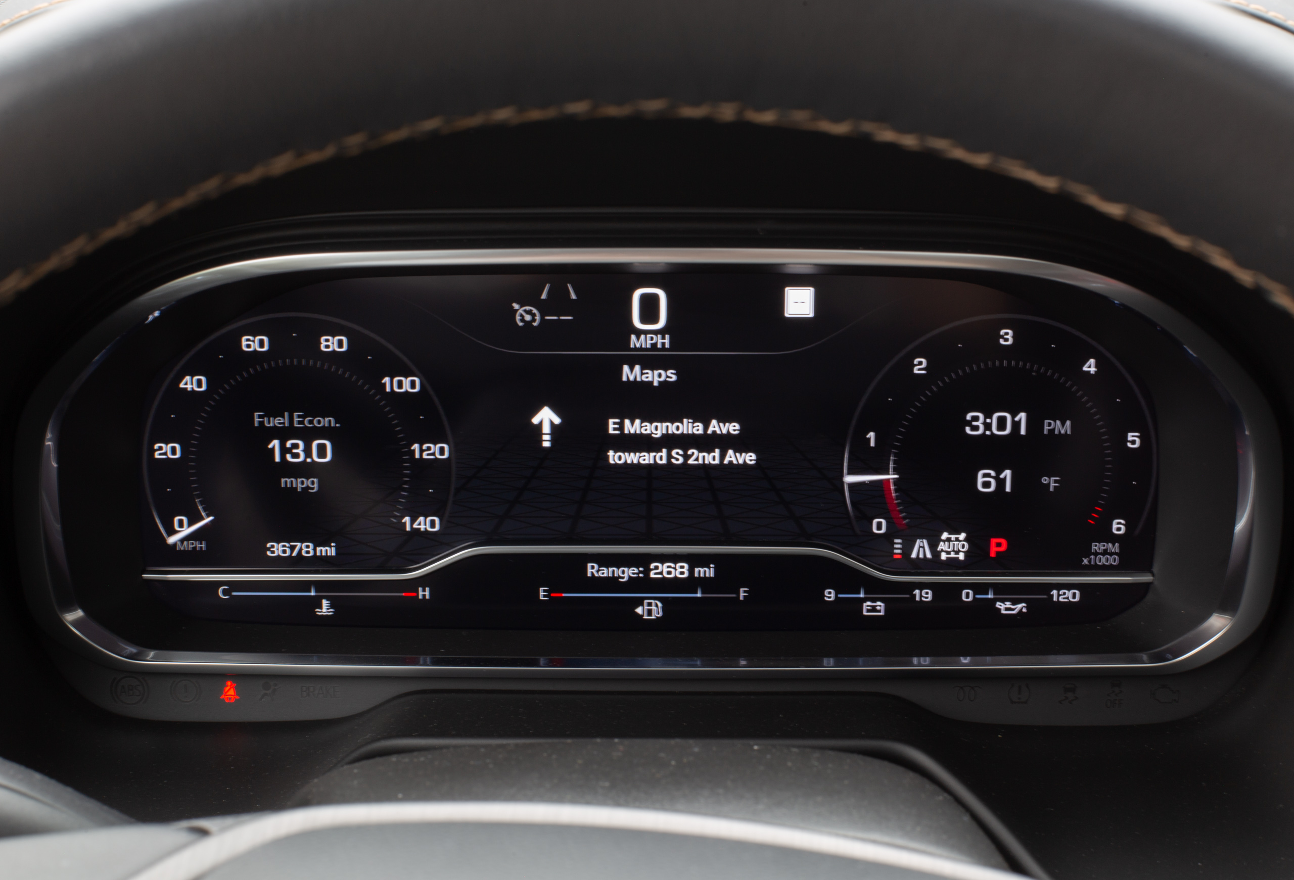 Here's the Yukon's 12.3-inch digital gauge cluster. It's not very flexible, and it almost always looks like this. Those two lines of data in the middle are all you ever get from Google Maps on the driver's screen.
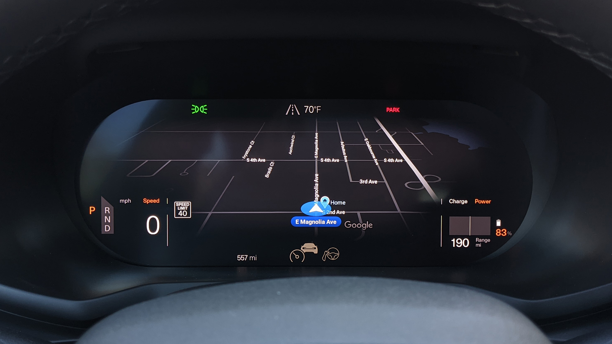 Compare GMC's work to this: the Polestar 2 gauge cluster, which can render a rich map interface, right in front of the driver. It's awesome.
The software is also old: It's Android Automotive version 10 with the June 5, 2021, security patch. Android Automotive releases around the same time as mainline Android, so the current version is 13, and this version is three years old. Many cars get no OS updates at all, though, so having a security patch from a year ago is a big improvement for the car market. Android Automotive being three years old is tough, though, and we'll talk through some of the strange design decisions of the Yukon's infotainment system that ended up being fixed in newer versions of Android Automotive OS (AAOS).
I don't know if GM had much choice, but the Yukon doesn't seem like it has been designed to be responsibly updated. There are four screens in the Yukon powered by three different operating systems, which must make it an impossible task to maintain. You'll be doing all your swipes and taps on a horizontally mounted 10.2-inch, 1280×768 infotainment touchscreen—a much more traditional layout compared to the Polestar's iPad-style system.
Besides that display, a 12.3-inch digital gauge cluster sits in front of the driver. Safety regulations make it illegal for the gauge cluster to run Android; instrument panels are required to never, ever lag, and that usually rules out anything based on Linux. The OS for these gauges is something like Blackberry's "QNX Operating System for Safety," which is purpose-built to meet the many safety requirements of regulators around the world. I could not nail down the exact OS here, though.
Android can still talk to the non-Android gauge cluster, but GMC's implementation here is a major disappointment. You'll see information about a playing song or your next turn for Google Maps directions, but you only get a small icon and a few lines of text. You can change what the left and right dials display, but the layout is always the same, and it's always just text and a gauge.
The Polestar 2 has a better implementation, which takes serious advantage of the digital nature of the driver display and offers several dramatically different layouts, including one that will render a full-blown Google Maps interface right in front of the driver. The Polestar 2's driver display layout wasn't just nicer looking with more information; it also felt safer to glance at the map right in front of you instead of the center console display. The gauge cluster display is the primary interface for the driver, so GMC's implementation is disappointing.
 One of the two back screens. These run WebOS, believe it or not.
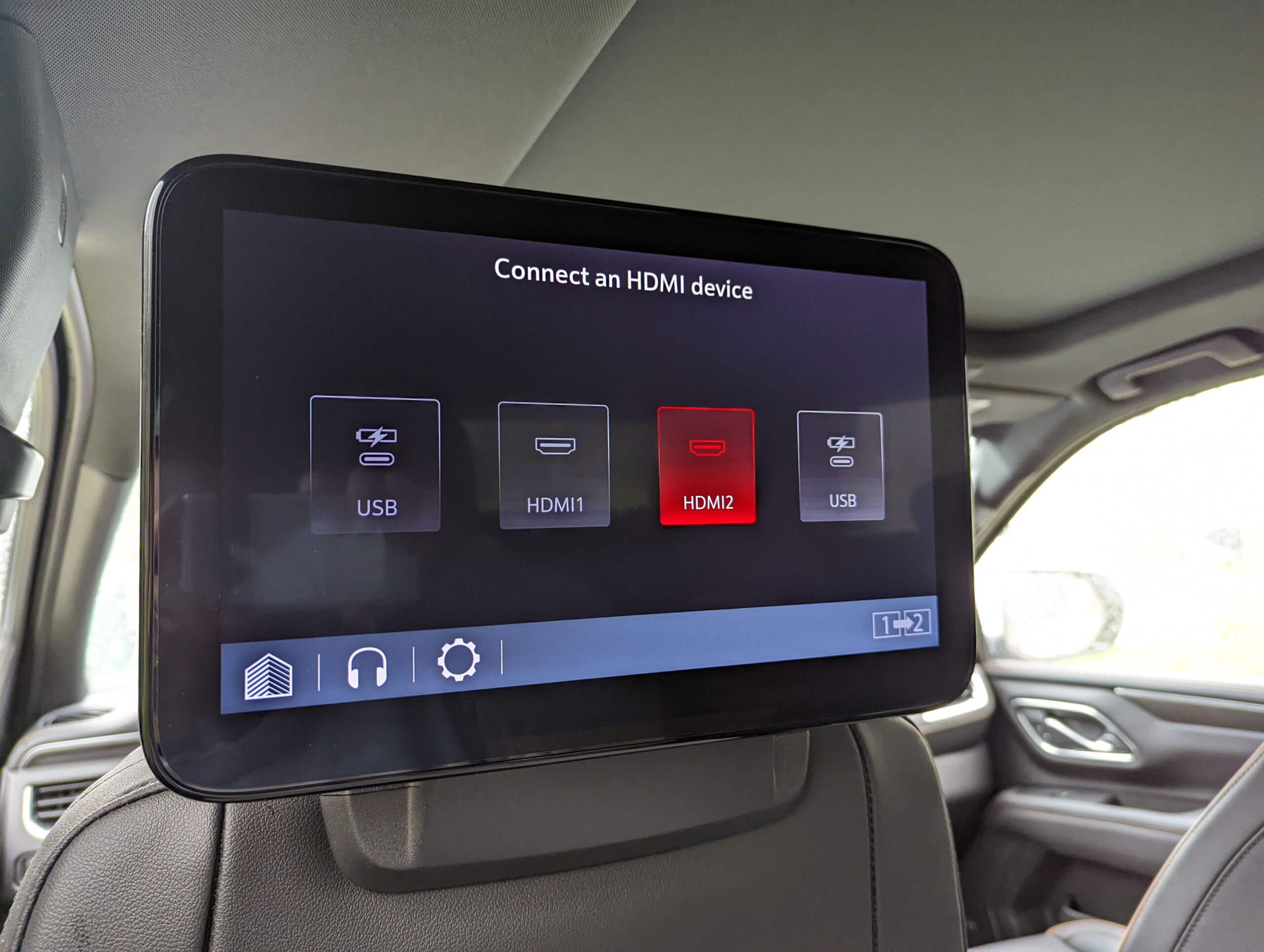 This "list of outputs" is really the only interface. Sometimes Hulu shows up as an option.
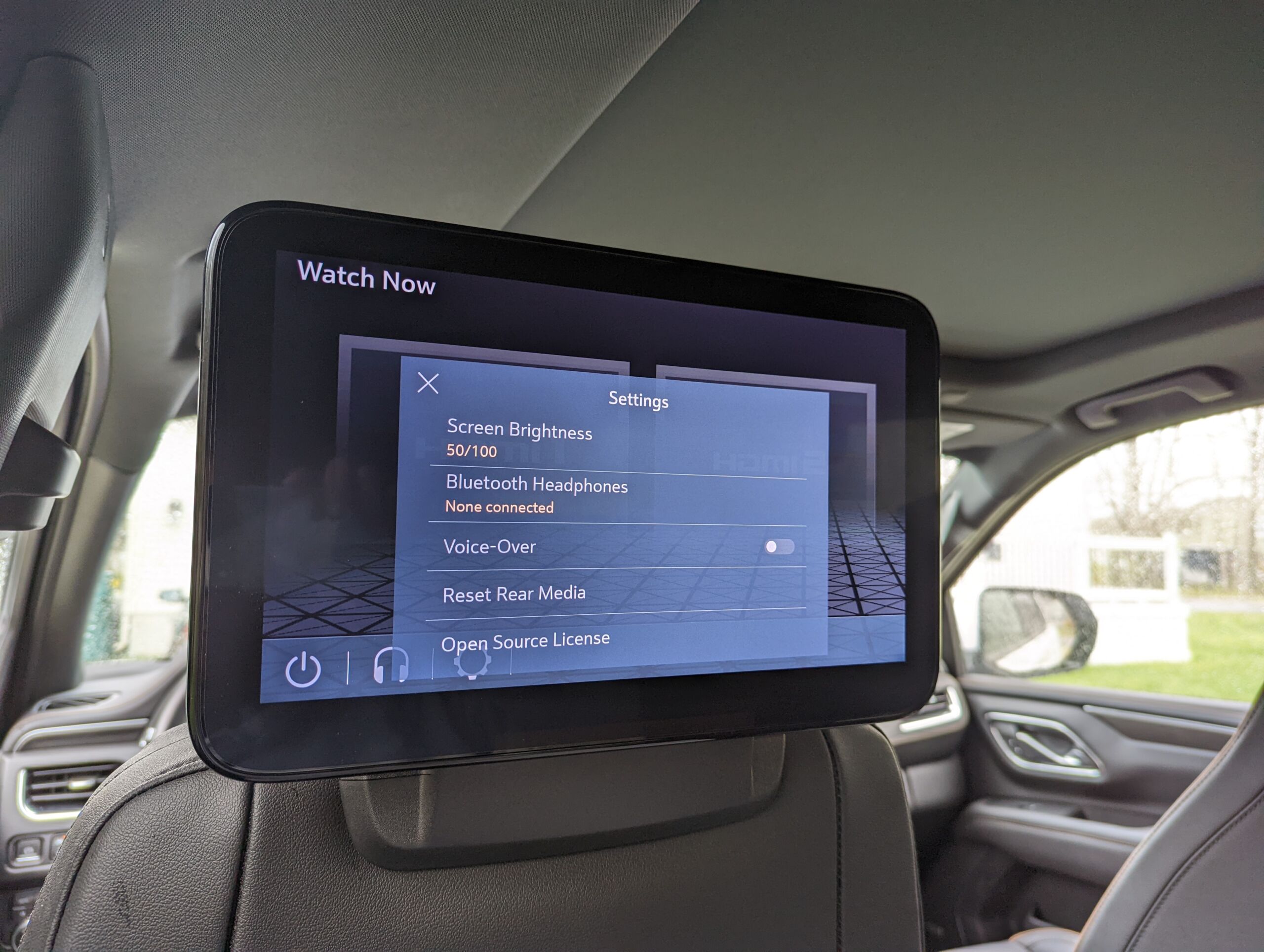 The settings.
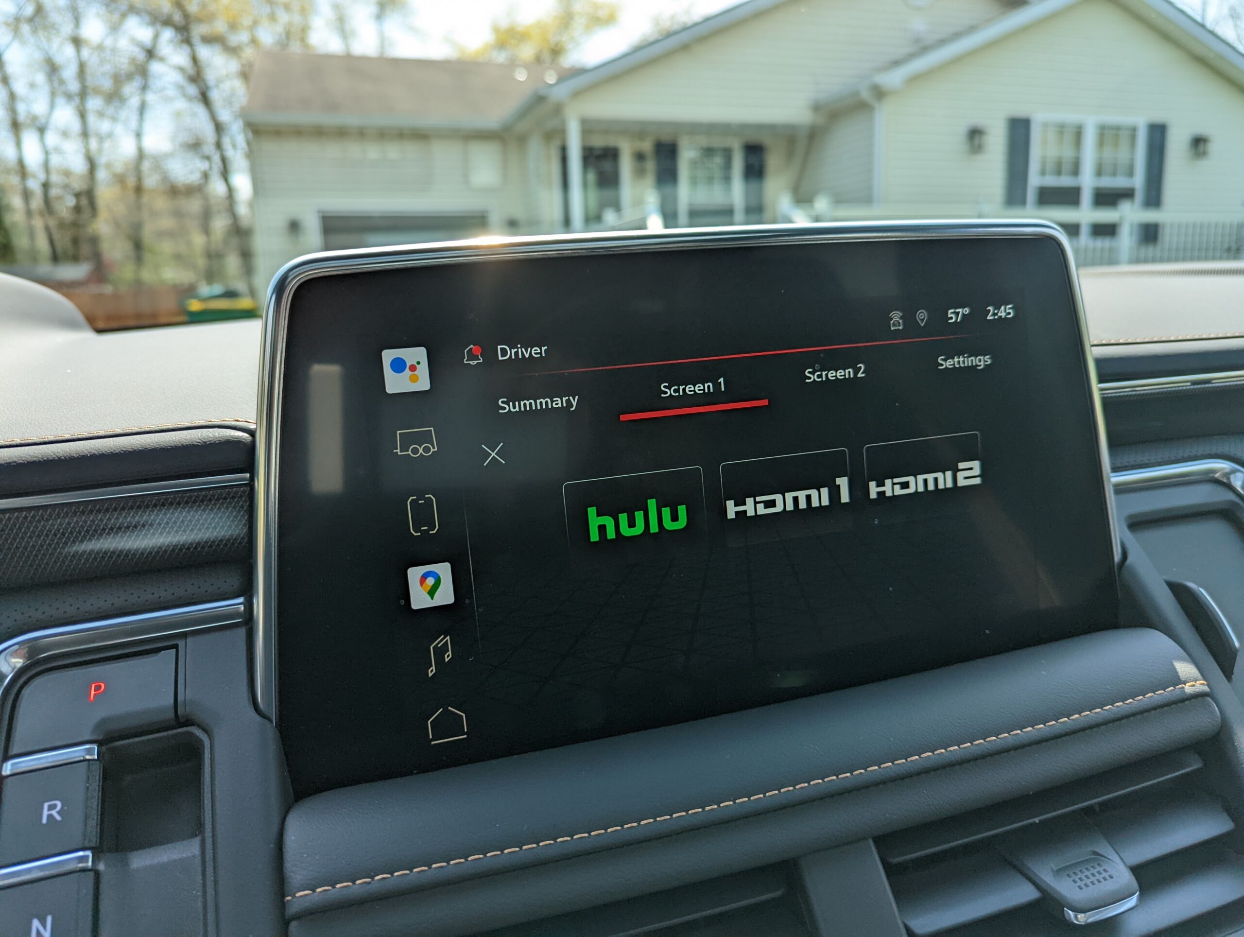 Here's an option to send Hulu to the back screens. This is the only thing they can display.
Things get really wild in the back seat of the Yukon. That's where we find displays 3 and 4, which are powered by the car's third operating system: LG's Web OS. The second row of the Yukon features two 12.6-inch LG IR12PT seat-back touchscreens that look like they were ripped right out of an airplane. These self-contained tablets are practically useless; they have an HDMI input and can sometimes run Hulu—that's it. (Yes, you have to pay for Hulu.)
The app situation in the back seats is broken, too. Hulu will randomly appear and disappear as an option—it happened to us during testing, and this is a common complaint online. When Hulu works, it shows up next to the HDMI input options and launches a locked-down web browser. Some models (not ours) also have a YouTube app. Android Automotive doesn't talk to these screens in any meaningful way. From the main infotainment screen, you can remotely select an input (Hulu or HDMI) for either of the rear screens, and that's it.
In GMC's defense, Google doesn't have a great solution for all these screens. Leaving aside the safety-centric dashboard display, for cost purposes, I'd imagine you'd want one big Android Automotive computer to run the front and back screens. You'd want apps for Automotive to work on every screen, and maybe even for users to be able to log in to each screen to see their favorite apps and services. While cars might be headed toward this future with a screen for every seat, Android Automotive is not yet up to the task.
Android 10 was the first version to properly support multiple displays with features like launching an app on a certain display, so Android Automotive 10 technically supports multiple displays, too. Android started as a one-screen, one-user, one-app-at-a-time OS, though, so multi-display support is very basic and comes with a long list of limitations. You can't run the same app on multiple displays. You can't have multiple users logged in at the same time. You can't turn individual displays on and off, and you can't bind a particular input to a particular display.
None of the separation or virtualization you would need to make a multi-user, multi-display interface exists in Android. Google keeps creeping toward this ideal, though, and Android Automotive 11 can send specific audio to specific audio outputs, so two users could theoretically listen to different audio sources at the same time.
A very conservative AAOS install
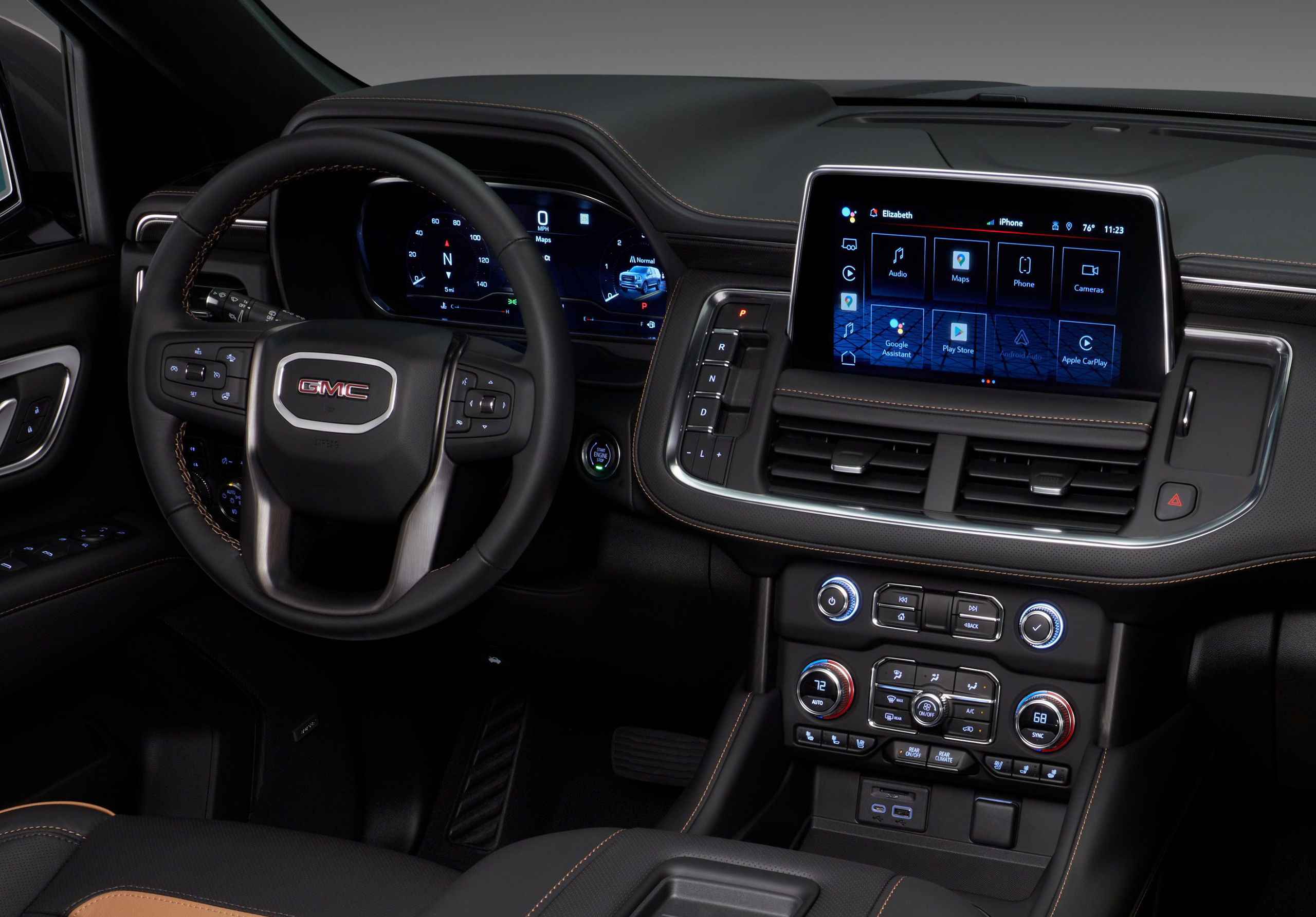 There is a center touchscreen, but overall, the GMC Yukon is very button-friendly.GMC
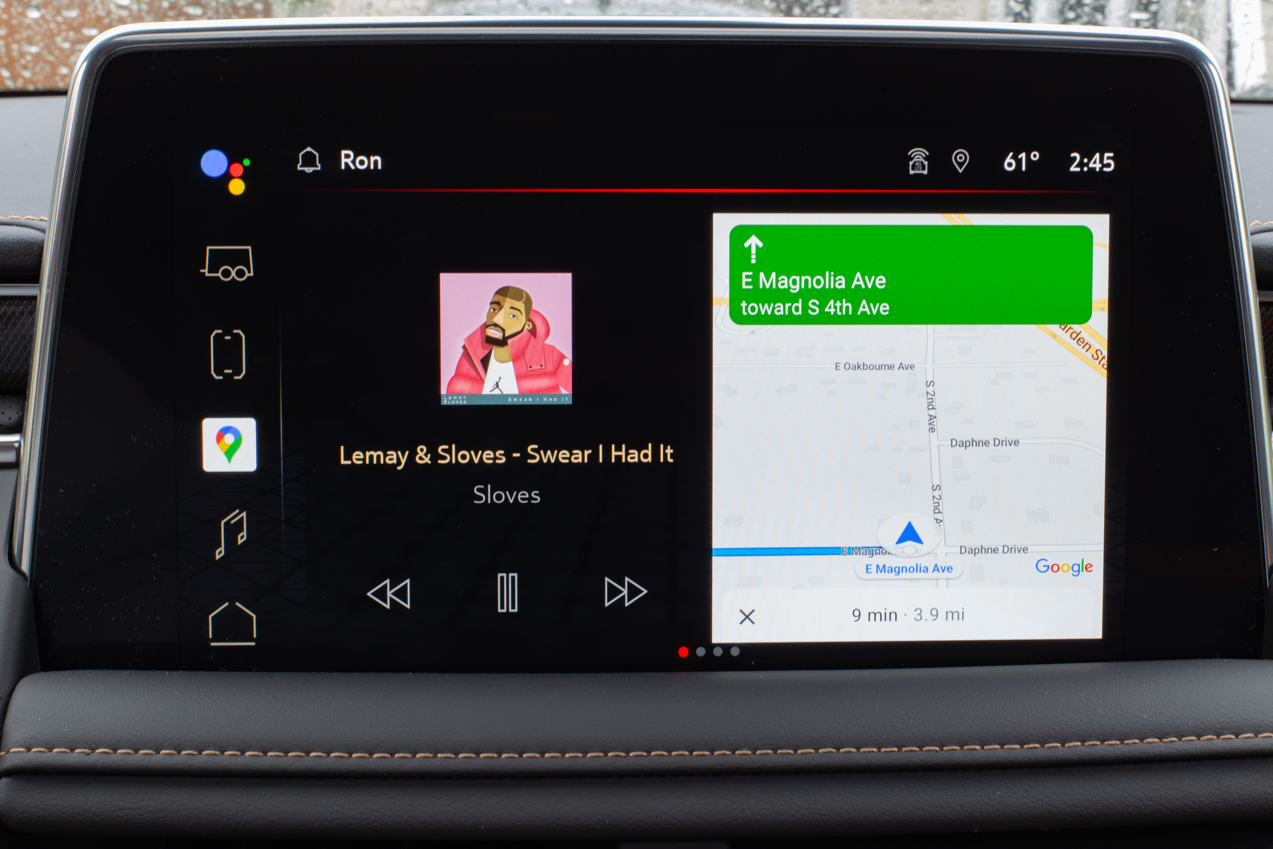 The home interface gives you a split-screen view of Music and Maps.
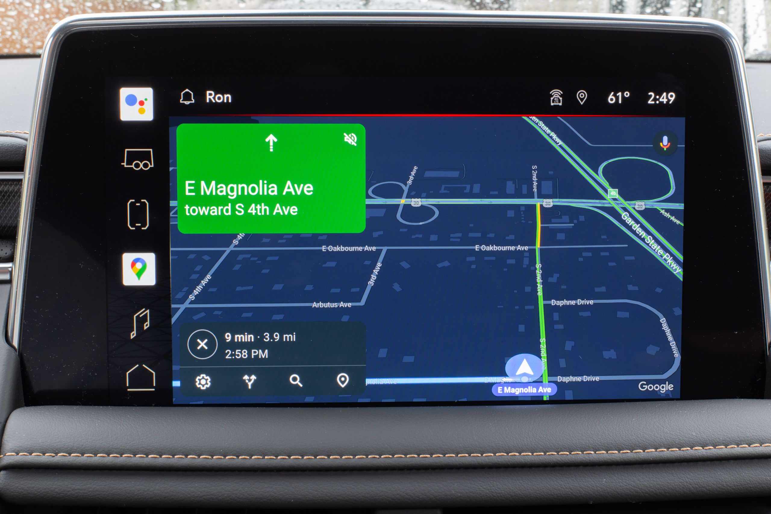 Full-screen Google Maps! The killer app for Android Automotive OS.
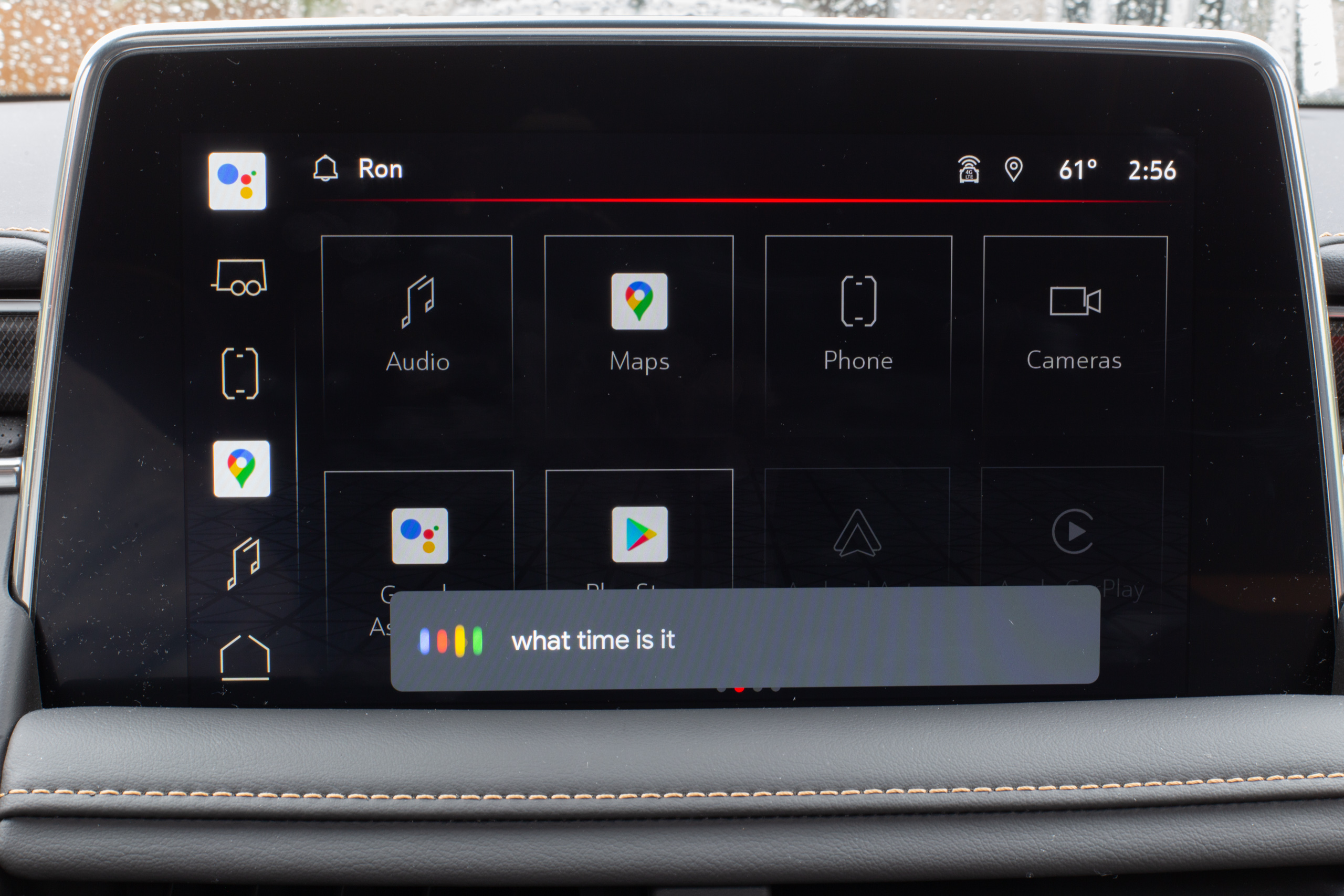 The other killer app, the Google Assistant.
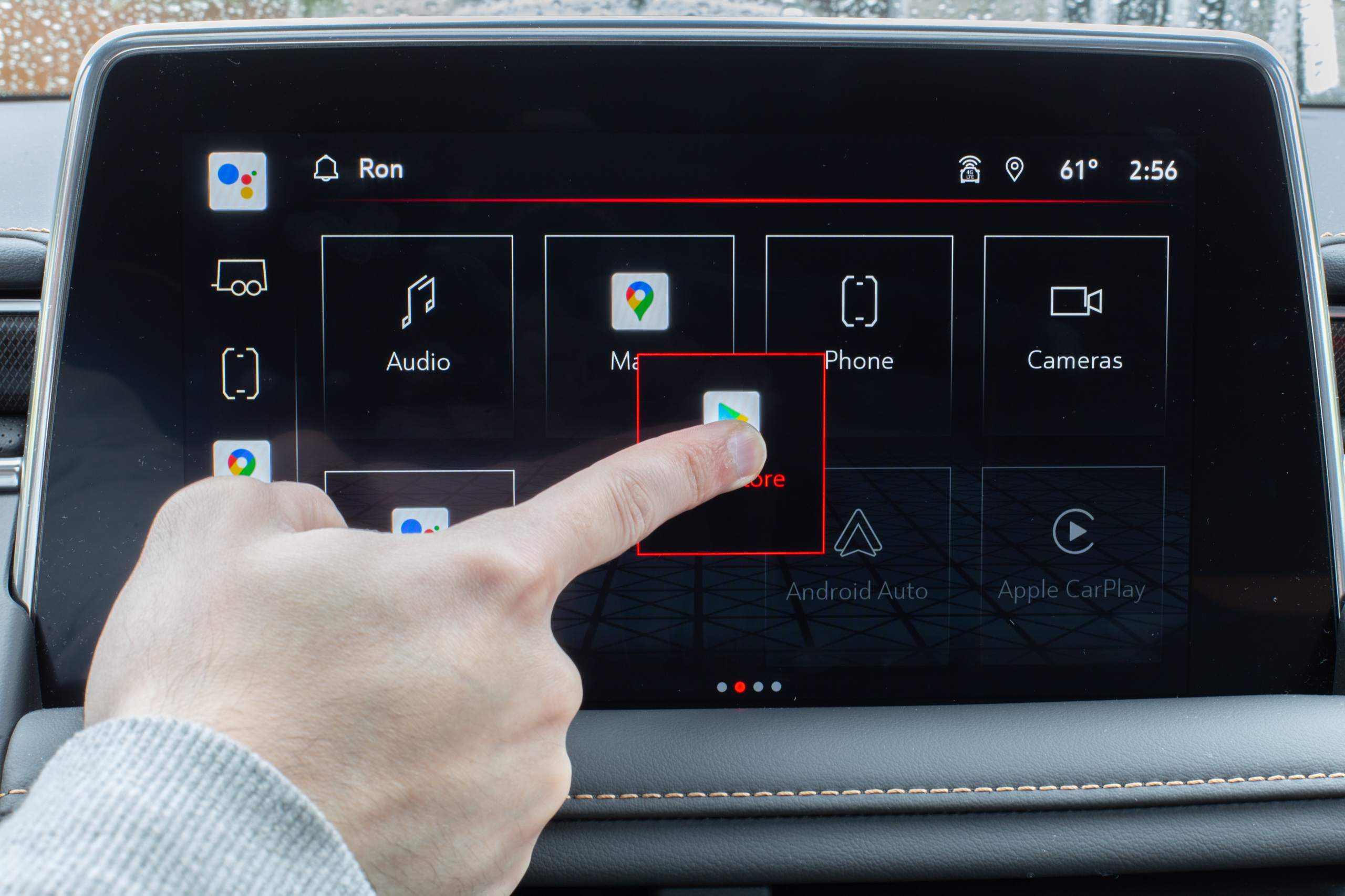 You can long-press on app icons here and move them to the sidebar.
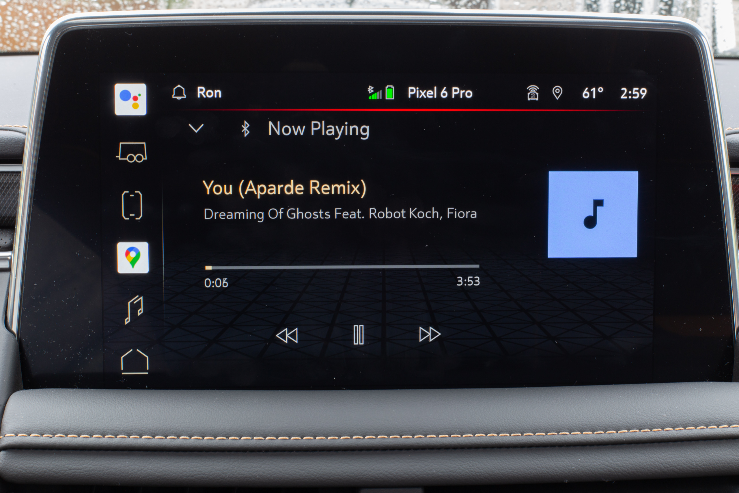 The music player.
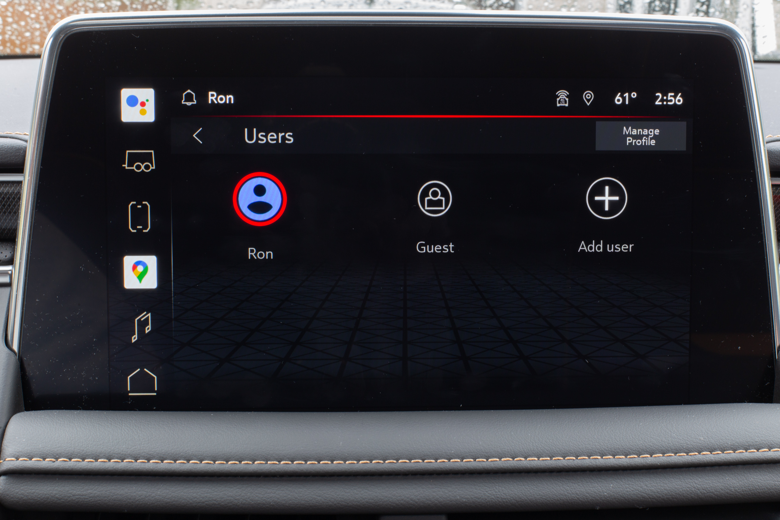 Multi-user support.
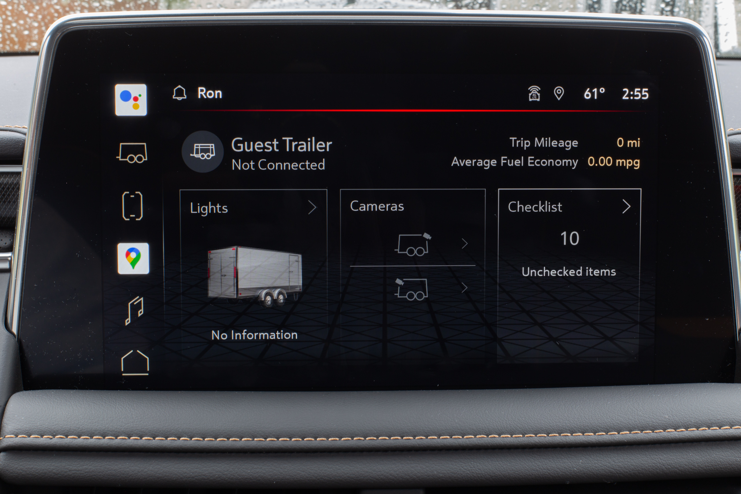 One of GMC's additions: a page for towing.
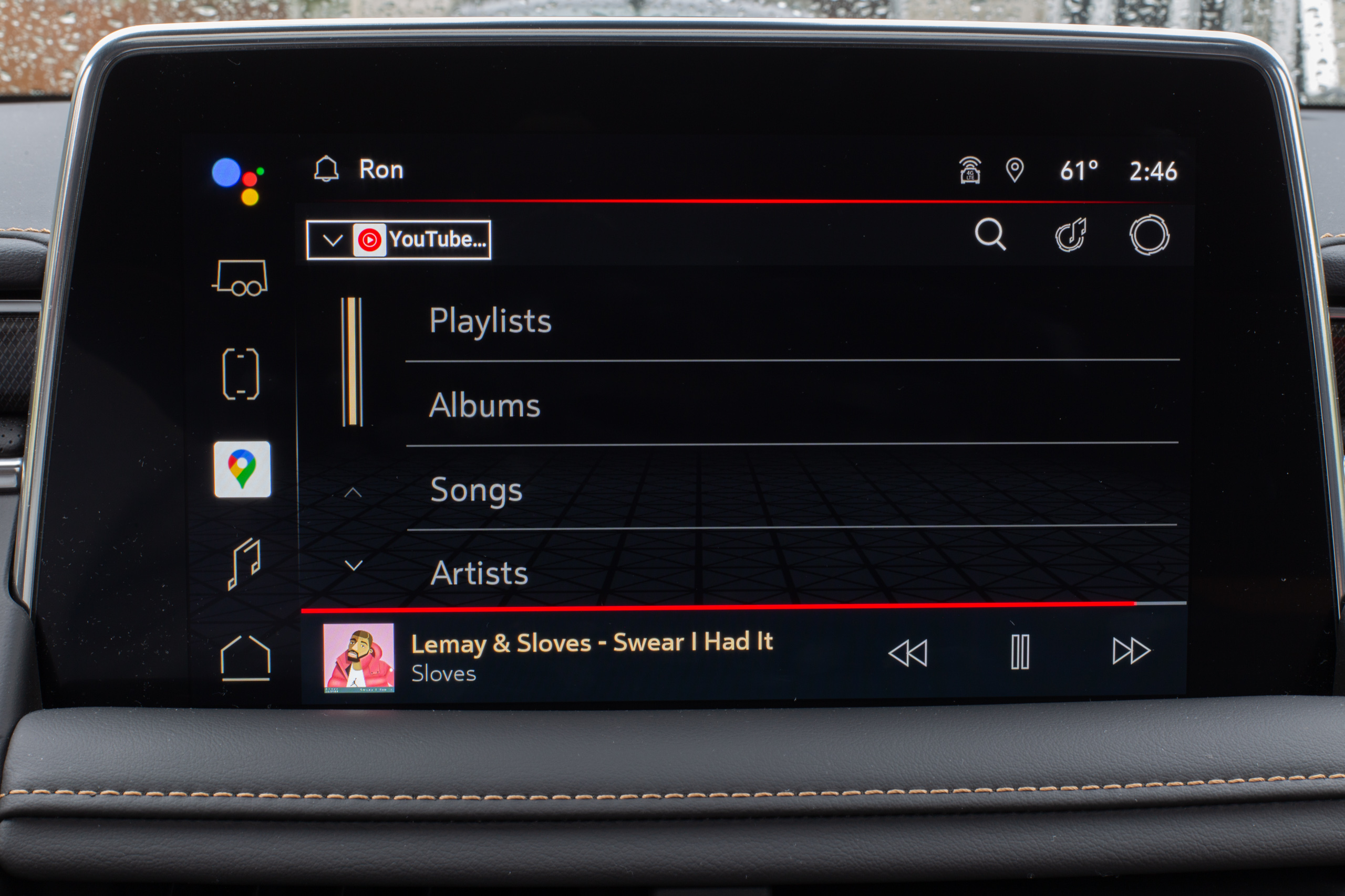 YouTube Music.
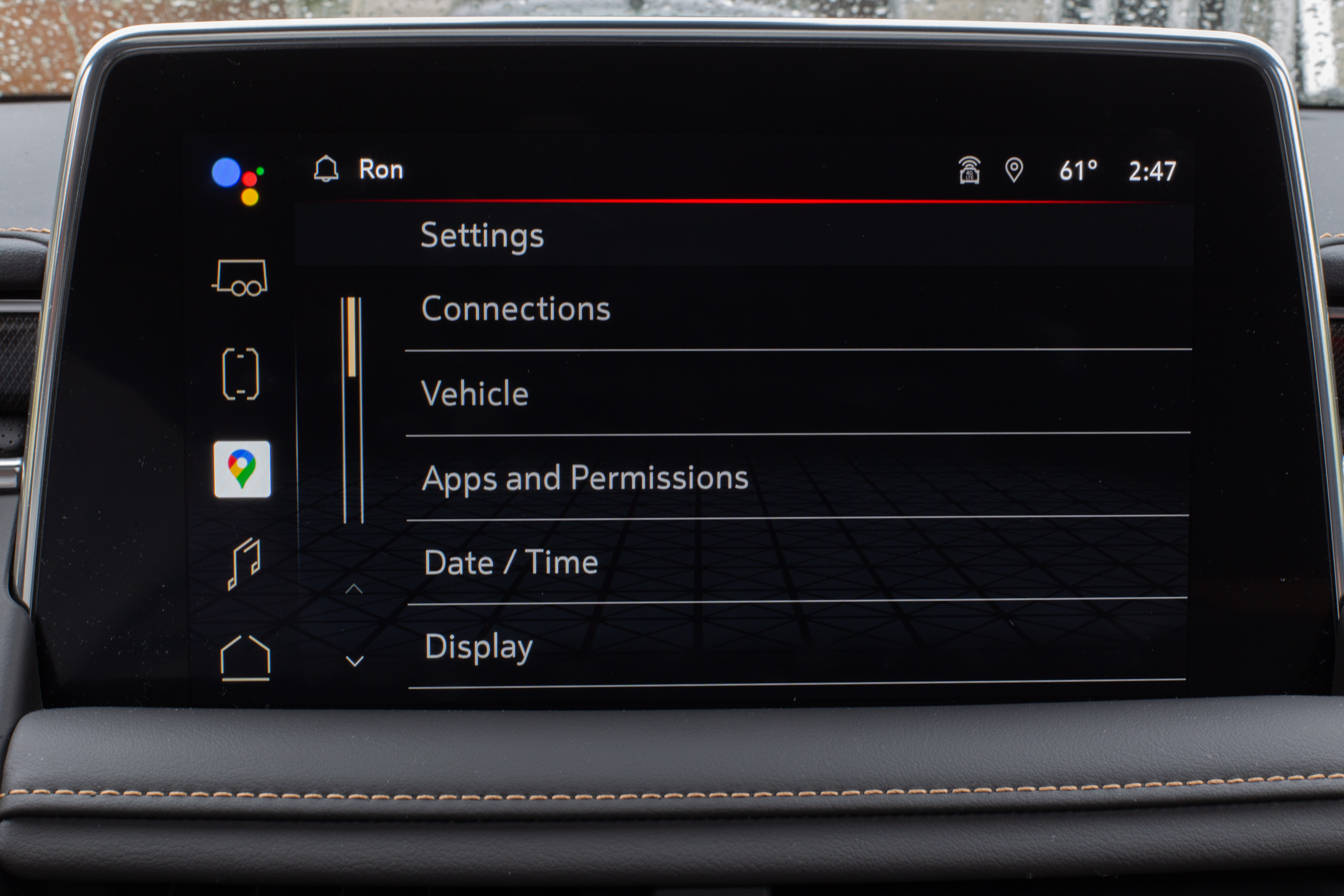 The settings screen.
It makes sense that the most mainstream install of Android Automotive yet is also one of the most conservative. There is still a whole suite of buttons for all the normal climate controls and drive modes, so Android is just here for infotainment purposes—apps and maps.
For the basic interface, you get an always-on vertical strip of shortcuts on the left-hand side for navigation and then a horizontally swappable set of pages. The first page is the primary home screen interface, which shows a split-screen view of music and maps—exactly what I'd normally want from a car computer. The other pages are a big 4×2 grid of app icons. If you happen to like any of the apps on that grid, you can easily drag them to the sidebar, where you have a max of six buttons. If you don't want to poke at the screen, saying "OK, Google" or pressing a steering wheel button will bring up the Google Assistant, giving your best-in-class voice commands.
The performance is surprisingly good given the ancient hardware, though it's still not up to the standard of a modern smartphone or tablet. Everything swipes and scrolls fast enough. You can pinch to zoom in Google Maps, which is smooth enough. It feels like we're at least five years behind the current normal technology trends, which was about when the 120 Hz screen craze started. We wonder how something as slow as an Atom A3960 will age as time goes by, but for now, the 60 Hz performance is acceptable. The Assistant is also pretty speedy when returning results, and apps launch quickly.
If you swipe down from the top of the screen, you'll get a notification panel and the words "no notifications." Does Android Automotive receive notifications? There are no messaging apps for Android Automotive. There are messaging apps that can work with Android Auto (the phone app), and Google swears there is an API for the full Automotive OS, but nothing actually works. You'll occasionally see something like a terms-of-service notification during setup, but the notification panel is only ever Android Automotive sending notifications to itself, making it pretty useless.
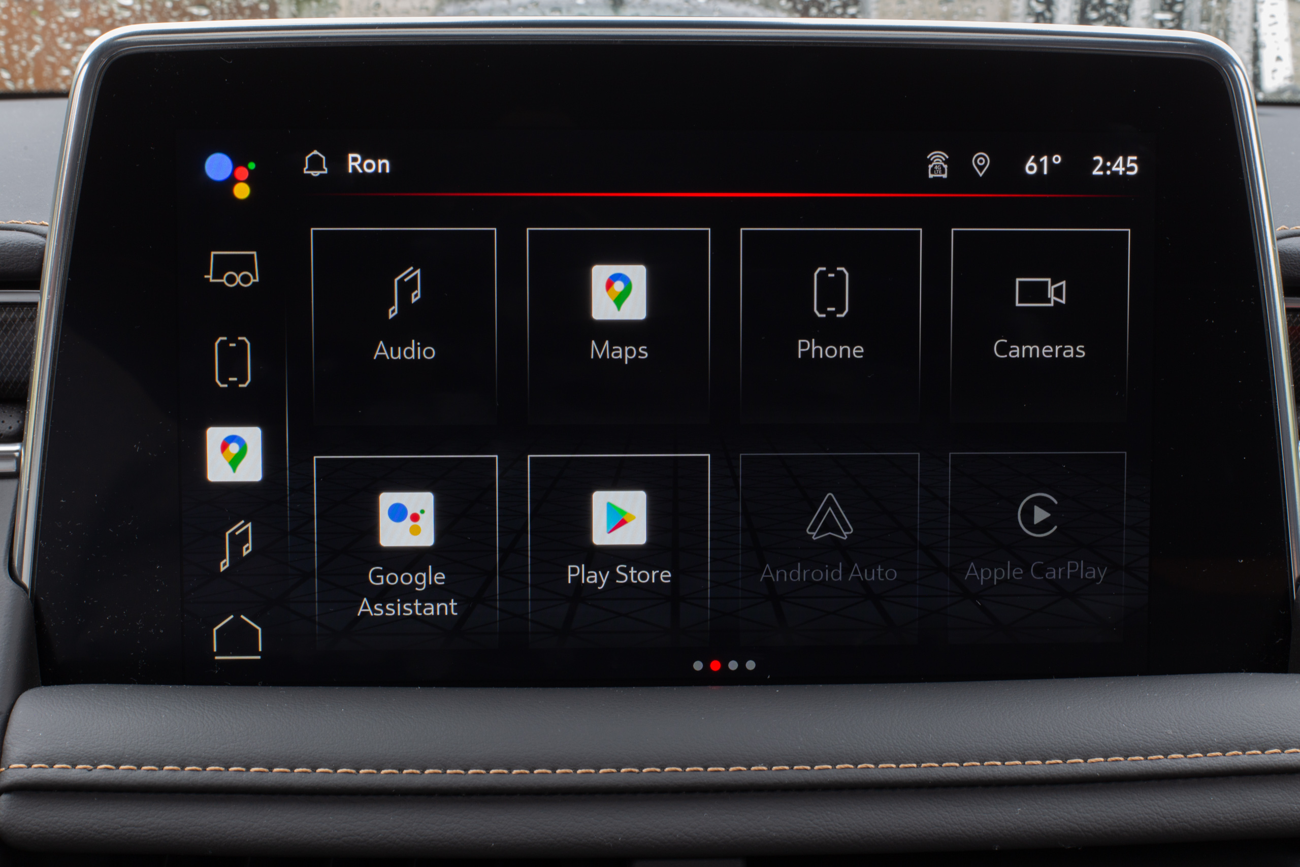 You're not allowed to skin the Google apps, and GMC's app icon design really clashes with Google's app icons.
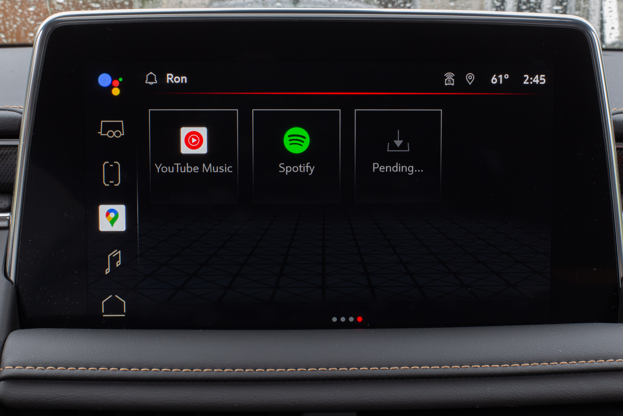 What is this deadly "Pending" button? Tapping it crashes Google Play.
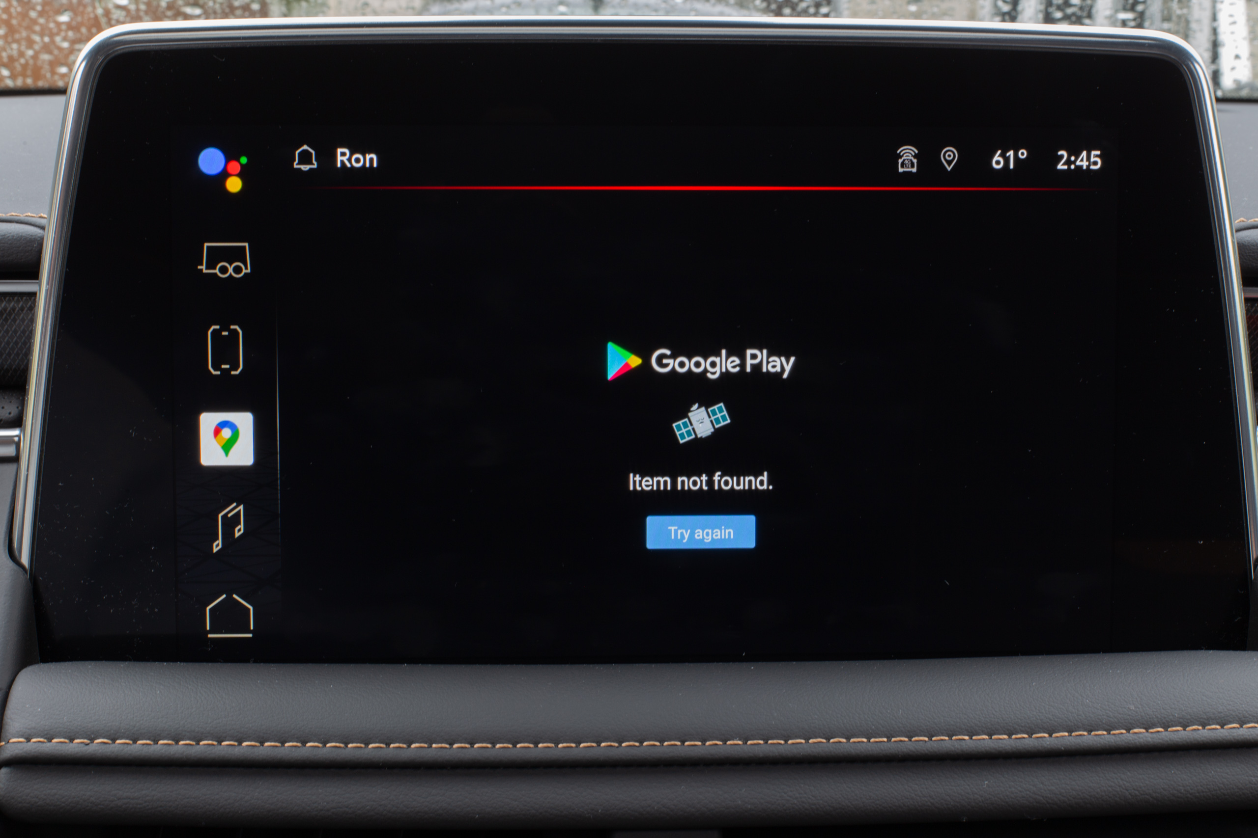 The world's most disruptive error message. The only button is "try again," and there are no dismissal buttons like "close" or "OK."
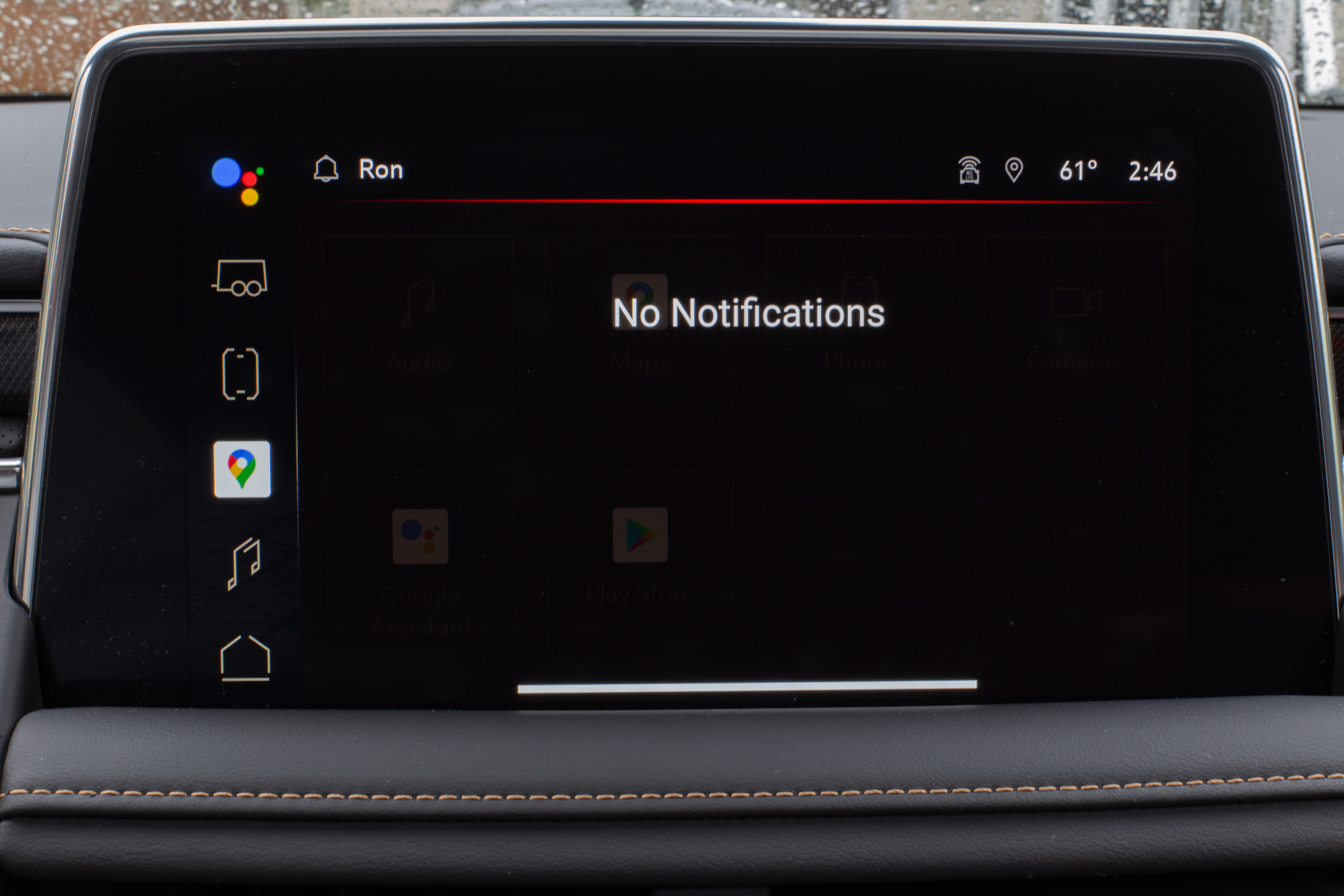 The always-empty notification panel.
Much of AAOS and the GMC skin feels unfinished or falls victim to the usual first-generation problems. The design is a mess, as GMC's and Google's art styles are completely incompatible. Just one look at the icons shows the division: GMC's icons are monochrome, segmented line art with black backgrounds, while Google's apps use the usual full-color, rainbow Google icons. You could not make them more different if you tried. Just as in normal phone Android, the base OS is fully skinnable, but the Google apps are not, and GMC's artwork doesn't even attempt to fit in.
I also ran into some bugs. One of the icons on the home screen says "Pending." I don't know what it's for or what it does. If you press it, the Play Store pops up an "Item not found" message. This Play Store error message presents only a "try again" button and no way to close it, so this message breaks the Play Store app until you dig through the settings to force-close it or power cycle the car. Don't press the "break the Play Store" button.
The Play Store sounds like a huge boon to have in a car, but it's currently not that great. The Play Store on phones features around 2.5 million apps covering everything you could want. The Car Play Store features... 37 apps. Here's the full list. Even that number is inflated by pre-installed apps like Google Assistant, Google Keyboard, and Google Maps, so there's not much new to pick from. You get big apps like Spotify, iHeartRadio, Amazon Music, and Tidal, but not much else. But hey, a lot of cars have zero apps.
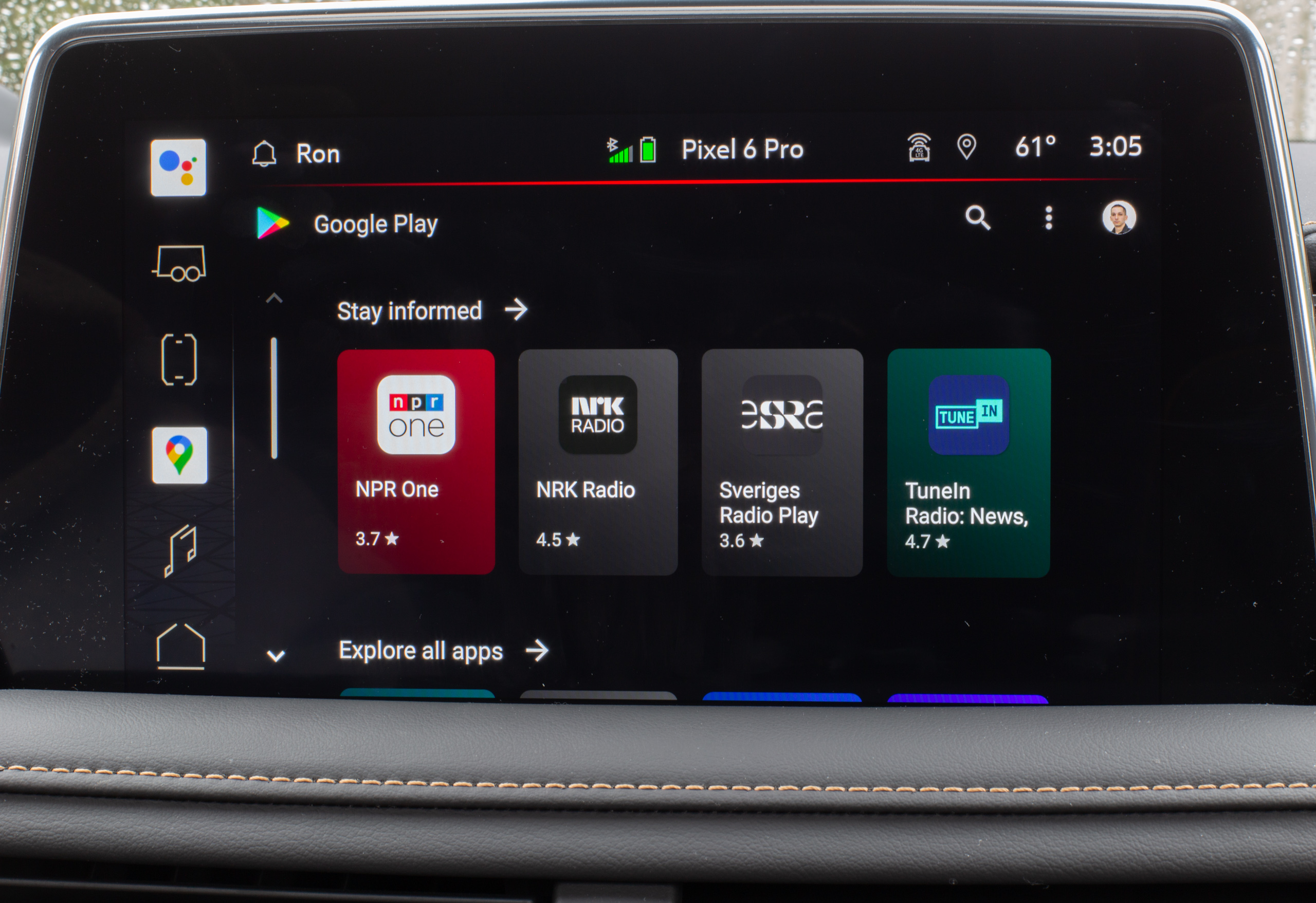 The Play Store. It really doesn't look like much.
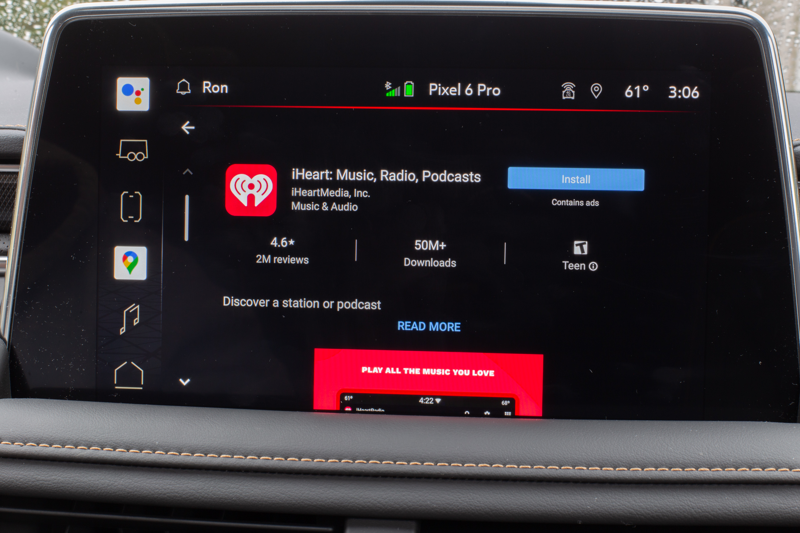 An app page on the Play Store.
Ninety percent of the apps are media players, and then there are single-digit examples of navigation apps (Google Maps and soon Waze) and parking payment apps. Messaging apps could be a good category, especially since they already exist in Android Auto (the phone app), where they allow voice replies and other nice features. There aren't any messaging apps in the Automotive Play Store, though. I would love it if I could install a smart home app so that my house could lock and unlock depending on my car location, but I can't do that. You can't install a gas price tracking app, an app that tracks where you parked, or a weather app. Even many media apps you might want, like Audible, SiriusXM, Apple Music, Pandora, and SoundCloud, don't exist for Android Automotive yet.
Safety limits while driving? Good. While parked? Dumb.
Safety while driving is paramount, and there are many exacting regulations around the layout and functionality of a car infotainment interface. But the limitations as implemented on Android Automotive hamper the experience more than they should. Huge chunks of the interface are designed for a lone driver operating the system at 60 mph, without any consideration for what's actually happening. What if you're in park? What if there's a passenger in the car? There are many times when the safety lockouts in the system aren't relevant.
As I said in our Polestar 2 review, a car computer should outclass a smartphone because size and power are no longer concerns. A car should have faster hardware, a bigger screen, and generally be more useful, just because it doesn't have to deal with the size constraints of a phone. Instead, the execution of yet another Android Automotive device makes it far less useful than a phone, and the always-on safety lockouts are a big part of that.
The killer app here is Google Maps, which is an absolute dream to navigate on the bigger car display, but it is also held back by the safety lockouts. A big part of the Google Maps argument is the near-infinite database of points of interest, but good luck sifting through that in your car. Even if the car is in park, you're limited to nine total results for any search.
After searching for something in Google Maps on a phone or a computer, you can scroll the map around to continuously load new results in the area you're looking at, or you can hit a "next" button and get a new page of results. Safety requirements put a hard nine-item cap on search results, and you'll hit that quota on the first screen. So you have to either add a city first and hope that what you're looking for lands in the top nine results, or you can pull out your phone and ignore the big, dumb car computer.
The same limitations apply to most of the UI. I have an alphabetically organized YouTube Music collection, but I can't scroll past the songs that start with "A" because the UI enforces a hard limit on how many pages can show up, even in park. Android Automotive can't really help you find what you're looking for because browsing any kind of list is basically off-limits. You need to already know what you want, and you need to get there before the interface locks you out. That's reasonable while moving, but it's maddening while you're in park.
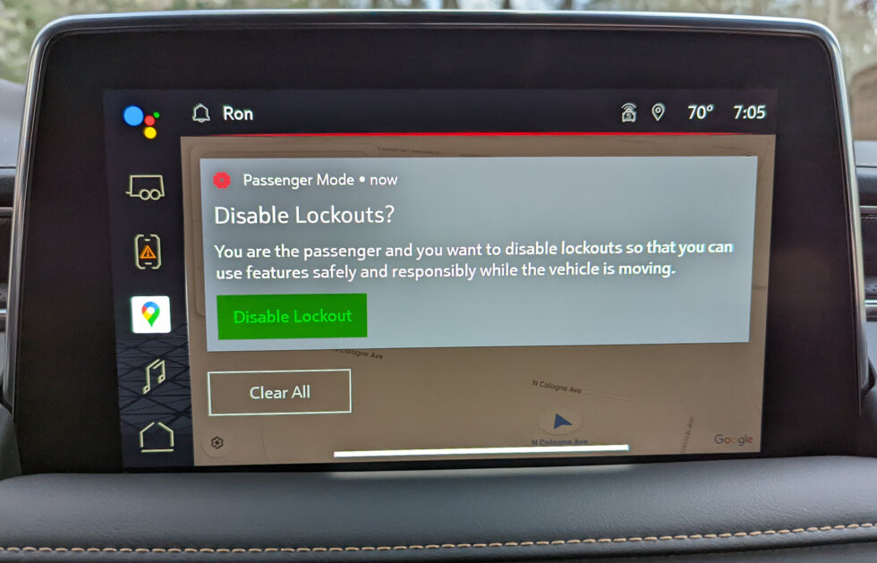
It doesn't have to be this way. Android Automotive knows when you're in park. Some features, like the QWERTY keyboard, already turn on when you're in park and disable themselves while you're moving. The GMC Yukon even goes a step further and pops up a cryptic screen about "disabling lockouts" when it detects a passenger is present. These detection modes are all here, but they aren't leveraged enough by the apps to open up the UI to be useful. It's very frustrating to start using a computer only to find out that you can't complete a task because of a limitation. It encourages you to use Android Automotive as little as possible.
There are signs that Google is slowly getting with the program, though. There's one browser app, Vivaldi, in the Automotive Play Store, though it's exclusive to the Polestar, so I couldn't install it. This is a perfect example of a "parked" app, where I've got this big computer in front of me and I just want to look something up with it. Tesla's implementation is much closer to how I think a car computer should work. Teslas even have access to the Steam game store now. I don't really want to play games in a car, and you definitely shouldn't be able to do so while driving, but I occasionally want to use my car computer like a computer while the car is parked.
Coming soon to a car near you
GM's implementation of Android Automotive might not be revolutionary, but it's a big win for Google and yet another sign that Android Automotive will soon be everywhere. Google already has Volvo/Polestar and GM on board, and soon it will have Ford and Honda.
It seems like we're on the Android phone trajectory with cars—a bunch of hardware manufacturers have suddenly found themselves forced to make software to a standard they aren't used to and aren't very interested in. There's the rare company like Tesla whose in-house software provides a market differentiation, but others, like Volkswagen, are suffering after botching an infotainment modernization effort. For Ford, Honda, and Subaru, class-action lawsuits have started flying after faulty systems hit the market in the past few years. In fact, the whole sales pitch for Apple's CarPlay and Google's Android Auto is that you can turn off your terrible car software and use something from Big Tech instead.
With Android Automotive, Google is offering these car manufacturers a life raft. Google can take care of a lot of that vexing software work while still (for better or worse) giving manufacturers control over branding. Plus, it will throw in some killer apps like Google Maps and the Google Assistant, and even an app store. Just as it was a compelling offer for phone manufacturers, it's also an enticing offer for car makers. And whether consumers want it or not, many companies are signing up.
The problem with traditionally clunky car computers is that you always want to ignore them because your phone provides a way better experience. While Android Automotive is a big step forward, it's still not better than your phone, which makes it tough to get too excited about. There are plenty of ways Android Automotive could be better than your phone—it could be used with hardware that isn't encumbered by the size and low-power demands of a phone, or it could be packed with useful features that take advantage of the big screen or the unique multi-screen layout of a car. Android Automotive—and the GMC Yukon build especially—doesn't embrace any of those potential advantages. It's hard to call the platform a success when I'd honestly be happier suction-cupping my 6.7-inch phone to the front of the 10.2-inch display.
Still, it's a first-generation product, and a lot of Android first-gen products start shaky and get better. But because cars take a long time to design and manufacture, it will be years before a second generation of these systems arrives.
The good
- It's hard to argue with Google Maps on a big screen. The process of navigating, assuming you already know where you want to go, is fantastic.
- The Google Assistant gives you speedy, accurate voice commands.
- The home screen, offering split-screen music and maps, is great. Those are usually the two primary features I want to access in a car.
- Android Automotive manages to wring decent performance out of a very slow computer.
The bad
- GM seemingly picked the cheapest computer parts it could find and then waited five years before shipping them.
- The car completely punts on the idea of a good interface for the driver's gauge cluster screen. It emulates physical dials and doesn't do much else.
- Android Automotive has 37 apps, and that's nowhere near enough. Where are the messaging apps, gas price apps, or an app for my smart home?
- Even in park, Google Maps search is limited to nine results. Browsing lists is useless because you can't scroll to the bottom.
The ugly
- Despite all the possible advantages of a car computer, Android Automotive is still a lot less useful than a phone, even for limited car tasks like navigation.
https://ift.tt/ZExc302
Technology
No comments:
Post a Comment