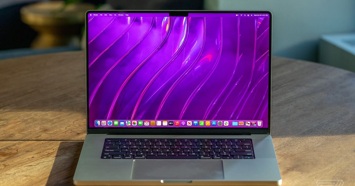
Apple’s new MacBook Pro notch is misbehaving. Early adopters have discovered inconsistencies in how Apple handles the notch across macOS and in individual apps, resulting in unexpected behavior where status bar items can get hidden under the notch. These inconsistencies make it feel like Apple has forgotten, in areas of macOS, that it has built a notch into the MacBook Pro.
Snazzy Labs owner Quinn Nelson has posted two videos on Twitter demonstrating some of the early notch issues. The main video demonstrates what appears to be a bug in macOS. Status bar items like Apple’s battery indicator can get hidden underneath the notch when status bar items are extended.
Nelson demonstrates this with iStat Menus, which can be hidden under the notch or can force system items like the battery indicator to be hidden underneath the notch. While Apple has issued guidance to developers on how to work with the notch, the developer behind iStat Menus says the app is just using standard status items and that Apple’s dev guidance “won’t solve the issue presented in the video.” This doesn’t appear to be intended behavior, as the notch works differently inside certain apps.
Nelson also highlights how an older version of DaVinci Resolve avoids the notch. In apps that haven’t been updated for the notch, you can’t even move your mouse pointer into it. Apple blocks off this space so that older apps can’t display menu items underneath the notch. 9to5Mac points out that this behavior is inconsistent across the rest of macOS, though, so if you have Finder in focus then the cursor can get lost behind the notch.
The notch can also exacerbate existing macOS issues. Apps like DaVinci Resolve (with extended menu items) can take over the space used by system status items. MacRumors points out this is regular macOS behavior, but that the notch obviously reduces the amount of space for both the menu items and status items. It’s an ongoing issue that has spawned apps like Bartender and Dozer to help manage the macOS menu bar.
It’s not clear how Apple will address these inconsistencies, even as developers update their regular apps to work around the notch. Thankfully, these problems will be extremely rare and will only likely appear in apps with lots of menu or status items.
Either way, it’s odd this wasn’t a design consideration ahead of the MacBook Pro launch. As Verge executive editor Dieter Bohn puts it: “Soooo the team in charge of Menu Items in apps was read in on the notch, but the team in charge of Menu Status items was not? lol”
In other words, don’t blame app developers, it’s notch always gonna be their fault.
Article From & Read More ( Apple seems to have forgotten it built a notch in the MacBook Pro - The Verge )https://ift.tt/3mlO6BO
Technology

No comments:
Post a Comment