Android 12 is not even out yet, but we already need to talk about Android 12.1, a rumored point release that would presumably arrive shortly after Android 12 and the Pixel 6 hit the market. The current thinking is that Google is working on a pair of Samsung-style foldable Pixel phones, which would ship with a smaller Android release. These are expected to come out—maybe—before the end of the year, development time and chip shortages allowing.
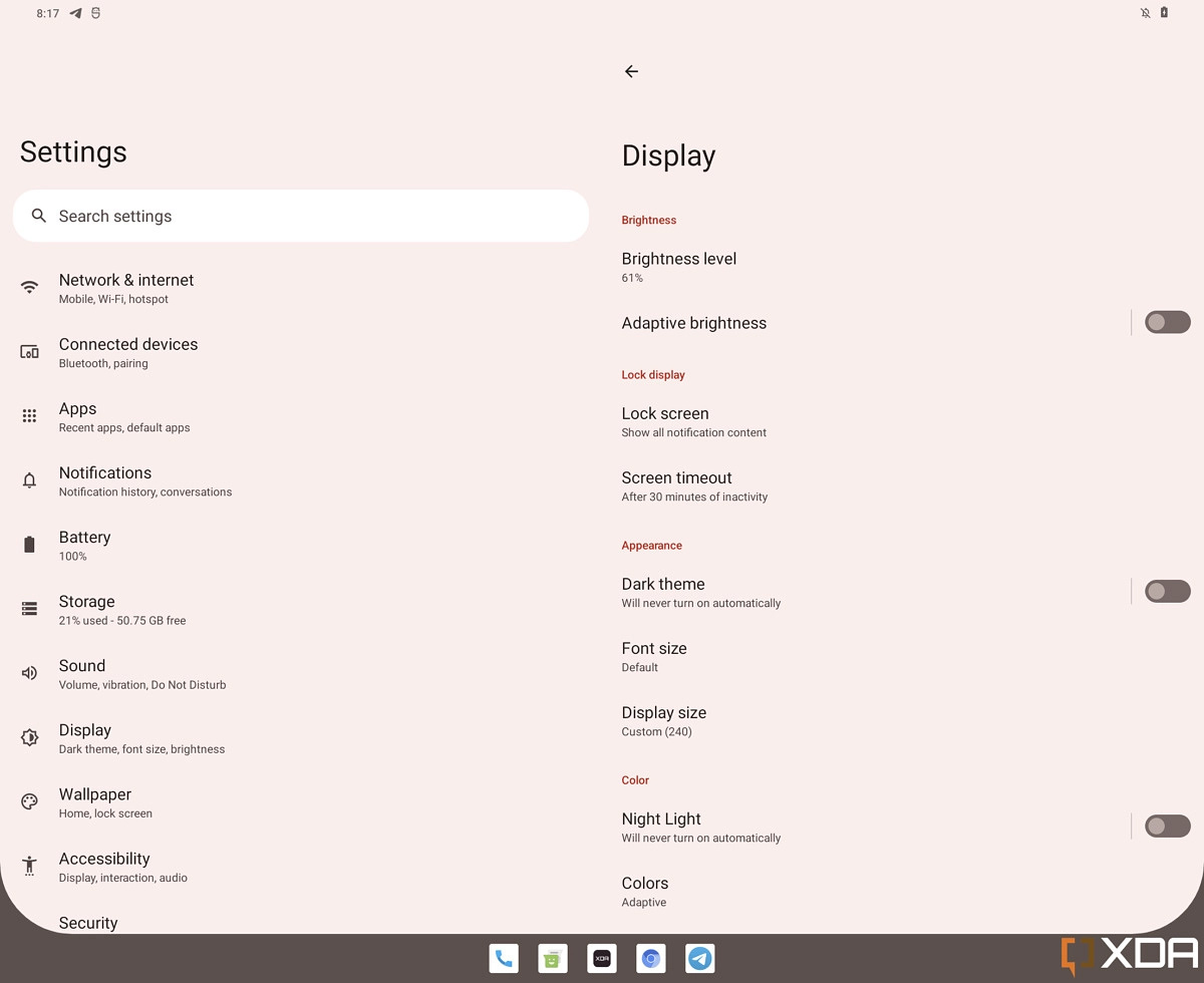 Dual pane settings are back!
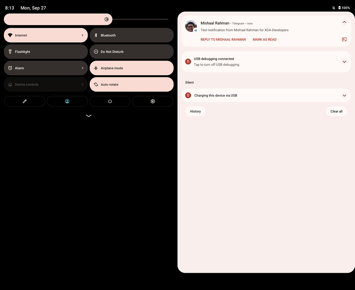 Dual-pane notifications.
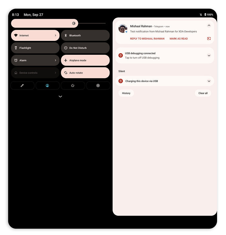 Both of these are just two phone interfaces next to each other, so if we adjust the screen aspect ratio to be "two phones next to each other," we get a much better looking interface.XDA Developers / Ron Amadeo
There's nothing official about the name "Android 12.1," but the puzzle pieces here aren't hard to fit together. Every Android release gets an API level for app developers. Unlike the marketing-controlled version number, the API level is designed to be predictable and goes up "1" for each new platform release, regardless of the size of each release. Android 12 is "API level 31," but Android 13—due out this time next year—was recently bumped to API level 33 in the public Android repository. Google made a space in between Android 12 and 13 for a new release. Everyone is unofficially calling that release "Android 12.1," following the maintenance release naming conventions Google last used with Android 8.1, which was released in December 2017.
So what's in Android 12.1? Foldables stuff. XDA Developers' Mishaal Rahman has a hands-on with some early code, detailing a ton of tablet and foldable-centric features. We want to stress the "early" part of that "early code" description, because everything looks horrible, but we're here for functionality, not design, right now.
Like the good (and quickly abandoned) Android tablet interfaces of yore, Android 12.1 sees Google return to dual-pane layouts for various bits of the OS interface. The settings screen is back to a dual-pane configuration, which has the top-level settings list on the left and each individual page of settings on the right. The notification panel takes a similar approach, with the quick settings on the left and the normal list of notifications on the right.
All of these dual-pane interfaces use a 50/50 split which is very different from how Google used to do things. Google's first swing at a bigger Android interface was in Android 3.0 Honeycomb, and that was designed for widescreen tablets. Honeycomb had something close to a 33/66 split for app layouts, usually a slimmer navigation panel on the left and a larger content area on the right. This new design emulates the layout split-screen mode for apps, with a right-down-the-middle 50/50 split. Every screenshot is just two phone interfaces next to each other.
XDA's example screenshots use a Galaxy Fold 3 aspect ratio, which is currently our best guess for what a Pixel foldable will look like. The thing is, the Fold seems way too wide for the design that's happening here. If Google is using two side-by-side phone interfaces, it sure seems like the correct aspect ratio for that would be double the width of a normal phone. The Fold 3 is wider than that, which brings up the standard Android issue of it looking ugly on wide devices.
This 50/50 design has the benefit of keeping content out of the hinge area, which usually has a trench or bump in it that can interrupt your swiping finger. That layout is just extremely limiting on how wide you can make a device, since the wider it gets, the uglier Android looks.
 This is official (but scrubbed from AOSP) Google artwork of the dock interface.
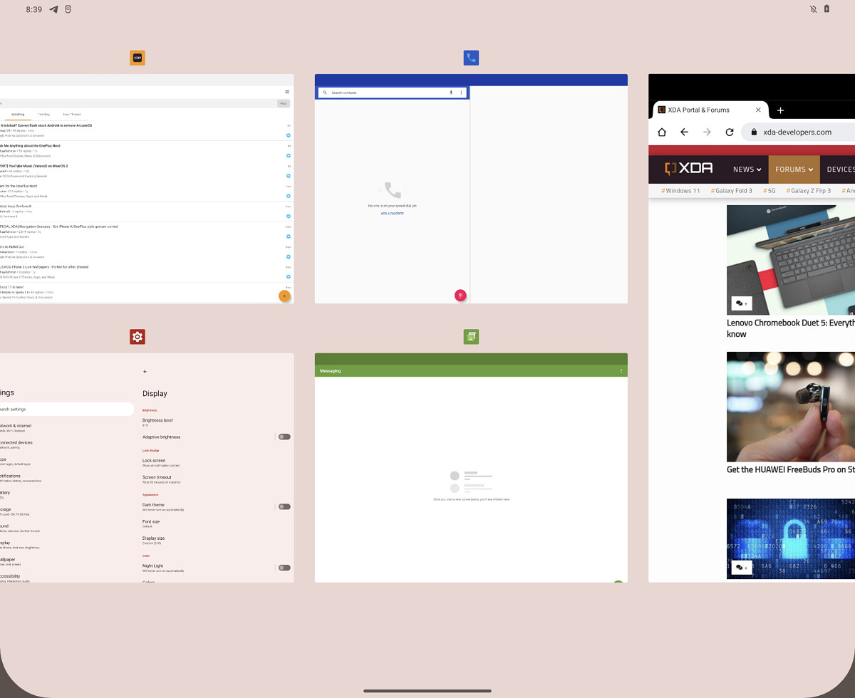 Recent Apps can now show two rows of thumbnails.
Google's leaked dock interface is here, too. The screenshots all have a pinned black bar at the bottom of the screen, making for a hybrid of the iPad's new dock UI and the old Honeycomb bar. Of course, everything could change eventually, but for now, the icons at the bottom just seem to be your recent apps. Being able to pin apps to this bar would be nice, too. The dock, assuming it doesn't auto-hide, will cut into the vertical real-estate apps have access to. Vertical space is currently a big problem for apps on foldables, especially when you aren't in side-by-side app mode.
Recent apps is also getting some work done. Besides the usual scrolling list of thumbnails, one row high, there is now a mode where thumbnails can be two rows high, letting you see more than one app. The screenshot actually shows one big app and then two rows of smaller apps.
More work is also happening around app pairs (shortcuts that launch two apps at the same time) and the split-screen app mode, which now has a new divider. Again, everything is very early and ugly, but Google looks like it wants to replicate curved display edges on the dock and the split-screen app bar. Like with the 50/50 app split, this is a design that could look good on a very specific phone design with similarly rounded corners. But for Android, which has to live on a million different devices, this design seems oddly restrictive.
Again, we have to stress this is very early stuff, and we haven't even seen the Android 12 release yet. Google has a few months still to figure everything out and make it look good.
Listing image by Ron Amadeo
Article From & Read More ( Android 12.1 leak shows off iPad-style dock, dual-pane system UI - Ars Technica )https://ift.tt/3ieL0x2
Technology


No comments:
Post a Comment