Rechercher dans ce blog

Wednesday, June 30, 2021

How to Download the watchOS 8 Public Beta - Lifehacker

Illustration for article titled How to Download the watchOS 8 Public Beta
Photo: Masarik (Shutterstock)

The first public beta for watchOS 8 is now available, giving users a chance to try out all the new features coming to Apple Watch Series 3, 4, 5, 6, and SE devices later this year. This early version of watchOS 8 includes the respiratory sleep tracking, new workout modes and multi-timer support, and tons of new changes to various Apple Watch apps including:

  • Photos: Support for memories and highlights, and images can be shared through iMessages and Mail.
  • FindMy: AirTag tracking support.
  • Apple Music: You can now share music via Messages.
  • Weather: Precipitation notifications if rain is expected in the next hour.

There are tons of other small tweaks in watchOS 8, all of which you can check out right now—but only if you have an iPhone running the iOS 15 beta. We can help you install the iOS 15 beta, but we strongly recommend you do not install either iOS 15 or watchOS 8 betas on your primary devices. Bugs and performance issues could make them unusable, and you cannot roll back to watchOS 7 once the watchOS 8 beta is installed. It’s better to wait a few more months for the stable versions to arrive.

With those warnings aside, here’s how to enroll your Apple Watch into Apple’s beta program so you can install watchOS 8 public beta now.

  1. Make sure your iPhone and Apple Watch are charged, paired, and near each other.
  2. On your iPhone with iOS 15, open Apple’s beta program webpage.
  3. Click “Get started,” sign in with your Apple ID and agree to the terms to enroll your account in the program.
  4. Go to the “watchOS” tab and tap “Download profile.” Allow the download, if prompted.
  5. Select “Install” then follow the on-screen instructions.
  6. Tap to restart your Apple Watch when prompted.

After the Apple Watch reboots, it will be ready to download the watchOS 8 update. There are two ways to start the download:

  • On your Apple Watch, go to Settings > General > Software Update and select “Download and Install.”
  • In the Apple Watch app on your iPhone, go to General > Software Update, then tap “Download and Install.”

Follow the on-screen instructions. Once the installation is complete, you’ll be prompted to restart your Apple Watch one last time. After it reboots, it will be running the watchOS 8 public beta.

[iMore]

Adblock test (Why?)

Article From & Read More ( How to Download the watchOS 8 Public Beta - Lifehacker )
https://ift.tt/3h67nof
Technology

Google sunsets the APK format for new Android apps - Android Authority

share it android google play store

Andy Walker / Android Authority

TL;DR

  • Starting in August 2021, Google will require all new Android APKs to land on the Play Store as App Bundles instead.
  • This will invariably result in smaller file sizes and other boons for the end-user.
  • However, it will also require app developers to push out APK versions of their apps to other non-Play Store channels, as they won’t support App Bundles.

For as long as Android has been around, Android apps have been launched in the APK format (which stands for Android Package). However, in 2018, Google introduced a new format called Android App Bundles, or AAB (with the filename *.aab). Google touted that this new format would result in smaller app file sizes and easier ways to control various aspects of apps. Of the millions of apps on the Google Play Store, thousands of them already use the AAB system.

Today, Google announced that the AAB format will now officially replace Android APKs. This means that starting in August of this year, all new apps submitted to the Google Play Store must come in the AAB format. Apps that are currently APKs can stay that way — at least for now.

No more Android APKs: Good news or bad news?

In the end, this is good news for the average consumer. Android App Bundles can be up to 15% smaller than Android APKs, for example. Developers will also have more control over how they distribute updates to apps, which will likely result in faster and more efficient app updates.

However, there are two significant issues with AABs. The first is that developers who want their apps to appear in other distribution channels — such as the Amazon App Store or Huawei’s App Gallery — will need to manually export APK versions of their apps. This won’t require much effort on the dev’s part, but it would mean that any developer who wanted their app to only appear on the Play Store would have that power. In those cases, end users would need to export AABs as Android APKs on their own, as *.aab files would not work on alternative stores.

Related: An introduction to the Google Play Console for Android Developers

The other issue is that developers will need to give Google their app signing key to export an AAB app as an APK. This gives Google quite a bit of power. The app signing key is basically proof that a specific developer created a specific app. While it’s unlikely Google would ever do so, it is possible that it could sign apps on behalf of a developer. It’s also possible that someone could gain access to this key and then sign apps for themselves. As such, some developers aren’t too keen on the App Bundle format.

The bottom line, though, is that all new Android apps on the Google Play Store will need to be AABs. There’s no way around it. This is a bold new direction away from Android APKs, but we’ll need to wait for the dust to settle before we draw any conclusions.

Adblock test (Why?)

Article From & Read More ( Google sunsets the APK format for new Android apps - Android Authority )
https://ift.tt/2ToukKj
Technology

Google is building support for digital COVID vaccine cards into Android - The Verge

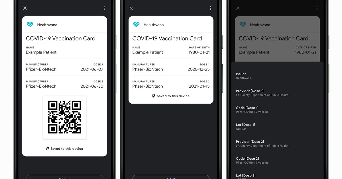
Google is opening up Android’s built-in passes system to let Android users store a digital vaccine card, which it calls a COVID Card, on their phone. The feature will initially roll out in the US, and it will rely on support from healthcare providers, local governments, or other organizations authorized to distribute COVID vaccines. The feature will also support storing COVID test results.

For vaccinations, your COVID Card will show info on when you were vaccinated and which vaccine you received, according to a Google support page. The card can be saved from your healthcare provider’s app or website as well as from texts or emails sent to you.

Google recommends that you add a shortcut to the card on your home screen and will offer the option when you save your card to your device. Google says that the card won’t be saved the cloud and that it won’t use the information you provide for advertising purposes, but it does say that it will collect some information, like how many times you use your card and on which days. And you won’t have to have the Google Pay app downloaded to save and access cards.

It’s good to see that Google is making it easier for people to save their vaccination status digitally on their phones, though whether you’re actually able to use the feature or not will still depend on your healthcare provider or government. Some states, like New York and California, have implemented their own digital vaccine cards, but Google’s version could streamline the process for other authorities.

Adblock test (Why?)

Article From & Read More ( Google is building support for digital COVID vaccine cards into Android - The Verge )
https://ift.tt/3qE4oql
Technology

We just tried the biggest new features coming to your iPhone and iPad this year - CNN

CNN —  

iOS 15 and iPadOS 15 are coming to your iPhone and iPad this fall to offer things like Focus modes and screen sharing on FaceTime — and we just got an early look.

Since early June, we’ve been using the developer beta of the two operating systems across a few iPhones and iPads. Many of the changes are impressive and make the devices feel a little bit newer, kind of like teaching an old dog new tricks. And if you’re interested, Apple is now rolling out public betas of iOS 15 and iPadsOS 15 — but be aware that it’s not final software, so bugs and slowdowns are likely. Some applications may not work and not all features are enabled. We’d highly recommend installing on a secondary device or, as a minimum, backing up your data.

Wondering if the new software is worth the download? Here are the biggest changes we got to try out on iPhone and iPad ahead of the official release of iOS 15 and iPadOS 15.

Focus modes for sleep, work and play

Jacob Krol/CNN

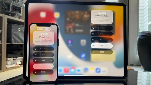
Let’s kick things off with the new Focus modes, which are essentially customizable Do Not Disturb modes. With iOS 15 (or iPadOS 15) installed, you’ll see that Do Not Disturb is now a feature under Focus along with Driving, Sleep, Work and Personal.

With a mode like Driving, Sleep or classic Do Not Disturb, you can silence all notifications, alerts and even calls. You can, of course, customize these to your liking, but Work or Personal modes are designed around certain apps and notifications being allowed through. When you set up a Work mode, it uses AI on-device to figure out what apps or notifications might be the most pertinent. As we progressed, it suggested allowing certain people to message us — some were spot on and others were a little off, but you also have the option to add other folks from your contacts. Neater though is the apps it suggested. Right away it showed Slack, Mail, Outlook, Trello and Monday.com — all apps that are used regularly for work. You can also go through and select other apps not mentioned.

Essentially you’re choosing the apps and notifications to get alerts from, and it lets you focus without worrying about missing an important message from your boss in work mode or a family photo in a big group message in personal mode. If you choose to go pro with Focus modes, you can also create a custom home screen layout for each. As a whole, it’s quite handy, but the real kicker is that these modes sync across all your Apple devices.

When you engage a focus mode like work on your iPhone, it will sync to your Apple Watch, iPad and Mac. If you turn it off from your iPad, it reflects on your Apple Watch, iPhone and Mac. Or if you switch to a different mode, it syncs across. That’s handy and ensures that if you’re turning it on for a video call, another device dinging or ringing won’t interrupt your flow. And yes, it works with all focus Modes — Do Not Disturb, Sleep, Work and Personal are all included.

Return of the status and added context to Messages

Jacob Krol/CNN

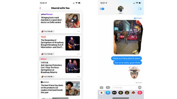
If you grew up in the era of AIM, you likely have a terrific screen name that follows you as an email address and remember the days of away messages: easy ways to alert your friends that you might not be fast to respond. Focus modes can enable a similar status for messages — essentially displaying that “XYZ has silenced his notifications” in the single chats or group chats. This is, as you’d expect, exclusive to iMessage. It’s a subtle way to let someone know you won’t be the fastest to respond, but it also gives them the chance to break through and notify that person anyway.

It’s useful, but we really wish we could customize the status to give those who see it a little more context. Additionally, you’ll notice there are now “Shared with You” tabs in apps like Safari, Apple News and Apple Music. And iOS is collating whatever is shared in Messages to serve it up in other apps. In music, we can see that a friend shared “Good 4 u” by Olivia Rodrigo in a group chat and “Letter to You” by Bruce Springsteen shared in a single message. In Safari, we see suggested websites to visit. If you tap on a shared item, you can also reply back right from there, saving you a few swipes. From what we’ve seen, this feature is limited to first-party apps, but we hope to eventually see other developers taking advantage of this.

Within individual or group messages, you can now see all shared items in categories. It makes it easier to find that photo or news article shared months back. When someone sends several photos, they’ll show up in a messy stack of sorts. It’s mostly a design change and lets you swipe between them and easily add them to your photo library. And if you use Memojis, know that you can, in fact, pick an outfit and customize it to a degree now.

It’s star time for FaceTime

Jacob Krol/CNN

The big news from WWDC 2021 was that FaceTime would be coming to Android and Windows through the web. It’s also a straightforward implementation — on iOS or iPadOS, tap “Create Link” in FaceTime, copy it, send it and then start the FaceTime. Family, friends or colleagues can open that link, enter a name and ask to join. You’ll have control over who can enter the room. It’s similar to Webex, Zoom, Skype or Teams and it feels like Apple wants FaceTime to be a preferred service for all people, even if they’re not in the ecosystem. We’ve tried a few of these and it’s pretty stable in a web browser, both on a Windows PC and an Android device. Know that on these third-party devices, you won’t get access to effects or many customizations, though. It’s fascinating to see Apple expanding on this and we can only hope that Messages might see the same expansion at one point — though we’d bet that’s a pay-for-service if or when the time does arrive.

SharePlay is the other prominent feature for FaceTime, and quite frankly, we wish it was in iOS 14, iPadOS 14 and macOS Big Sur. After all, we’re still in a pandemic and the ability to screen share or watch content together would have been clutch for the last year. Alas, it’s here now and is in the Public Beta (or Beta 2 for developers). When in FaceTime, you’ll tap the “SharePlay” icon — a window with a person — in the top right corner to enable sharing your screen or the content from the app you’re within. So if you’re just in FaceTime, it will start showing off your screen or if you’re in Apple Music and selecting a song, it will begin to share that content.

Screen sharing seems like it will be especially useful for providing tech support or just explaining a walk-through on how to use something. iOS will automatically recommend you turn on a Focus mode to hide notifications as well. And the person or people on FaceTime will not be able to control your screen. This also works across devices, so a viewer on macOS or iPadOS can still see your screen. It also means they can see the content you’re streaming and currently, in the betas, it’s limited to Apple TV+ and Apple Music. You can fire up an episode of Ted Lasso and all members on the call will see playback while also have the option to control it. It’s neat and similar to GroupWatch on Disney+, which seems a little smoother thus far. FaceTime and iOS also handle volume leveling; this way, you can hear others on the call and the show. SharePlay as a whole might be the best feature of iOS 15 and come this Fall, more apps will have support for it.

For classic FaceTime calls, you’ll now be able to turn Portrait Mode on which works great and helps keep the focus on you. Again, this is similar to blurring your background, like on Zoom or Webex. You will need a device with the Neural Engine for this feature to be enabled. That includes the iPhone 8 and newer, along with the 2020 iPad, 2019 iPad Air or Mini and the 3rd Gen iPad Pros or newer. And when you’re on a group FaceTime you can now set it a grid view, so folks aren’t bopping around your screen.

Safari, Siri and Maps

Jacob Krol/CNN

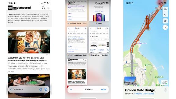
Like Safari on macOS Monterey, Apple’s web browser has a whole new design on iOS and iPadOS. And we’ll be honest, it’s a little jarring at first — the search bar and main controls are now at the bottom and it’s mostly gesture based. It took a few days for us to get used to as it’s changing up the muscle memory that iPhone and iPad users have known since the start. Theoretically, it’s easier to reach here and still, you’ll just tap the bar to search for a site or a topic.

All of your tabs from across your Apple devices will be synced in real-time also, and a slight pull up from the bottom displays all of them This is just one of the new gestures built into Safari, you can also swipe to move between your open tabs. And the best one is that you can pull down from the top to refresh. We’ll need to keep using Safari throughout the beta period to truly get a hang of the new features.

Siri has a bunch of new features within iOS 15 and iPadOS 15, but the one we’re highlighting is on-device support. Your audio is now processed and anaylzed on device (if it features the Neural Engine) and this in turn allows you to do some things offline and for better personalization that’s localized to your Apple devices. You can control playback, enable alarms and even make calls without the need for data or Wi-Fi. And as a whole Siri is just quicker for delivering results.

In early 2020, Apple rolled out the redesigned United States map for the Maps app, and now there are even more new features. These start with a new look that focuses on details and a more realistic-looking map. Geographical features like mountain ranges along with elevation are here and Apple’s added location-accurate trees as well. It looks pretty neat, but doesn’t necessarily assist with getting you to a location — what it does do is provide really detailed roads, complete with crosswalks and notations on the street. When navigating, Maps will also give detailed instructions on what lane to be in and maps around major intersections or highways present more information, all in the name of keeping you on the right track.

Maps is also a source of entertainment or discovery to a degree with new nighttime visuals, currently available for locations in California. The 3D Maps around the Golden Gate Bridge, Alcatraz and even the SF Apple Store are heavily detailed and they really do look stunning. We’ll be hitting the road more this summer to test all of this out.

What’s new on the iPad?

Jacob Krol/CNN

iPadOS 15 includes everything that we’ve already touched upon above — Focus mode, on-device Siri and FaceTime changes all included. There are three significant additional changes specific to the iPad, though.

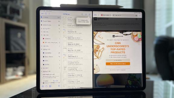
To start multitasking in iPadOS 14, you need to use gestures to put two apps side-by-side or even a mini window for a third floating app. Whenever you have an app open, there are three dots centered at the top and this is the “multitasking menu.” Tap that, and you’ll see the three possible modes — a single app, split view or slide over. Tapping the Split View, which is displayed as two halves, slides your current app to the left and lets you pick the second app from your home screen. This is much simpler than remembering gestures and lets you quickly find the app you want to choose. You get complete control for swiping between home screens and even opening up the App Library (also new for iPadOS 15). It’s not an entire rethinking of multitasking on an iPad, but it’s a straightforward approach that we’re quite fond of. You can also save instances of Split View (IE: Safari and PDF Expert, Notability and Files), and they’ll appear on a shelf above the dock. This way, you can switch Split Views on the fly.

As we mentioned above, App Library, which is a list of all your apps or organized folders by category, is finally on the iPad with this update. It premiered in iOS 14 on the iPhone and iPod Touch, leaving us scratching our heads why the iPad didn’t get it. Apple’s corrected this and is also bringing widgets to every home screen in iPadOS 15. This helps create a page dedicated to a specific task; we have one for work that includes Mail and Deliveries (a package tracking app) widgets and folders for our essential apps. There’s also an extra-large widget size that takes advantage of the iPad’s bigger screen.

Scribble, which lets you use the Apple Pencil (or a stylus) to write in any field and have it transcribed into text, is getting a big boost. Quick Note allows you to quickly take a note, kind of like a digital sheet of paper or sticky note, anywhere within iPadOS 15. You can embed a URL link or even drop an element into the note. These automatically sync in your Notes app. You’ll just swipe from the bottom right corner and can start writing. When scribing with the Pencil, iPadOS can translate it into text or you can leave it as handwriting. We’ve been using it a lot for meetings and for quickly jotting down notes on the fly. You can also choose to type in the mini note window with a physical keyboard or the on-screen one.

These might seem subtle, but the dedicated iPadOS features, alongside the rest of iOS 15, create a significant update that makes it easier to get more done on your device.

Let’s recap

Neither iOS 15 nor iPadOS 15 delivers a true redesign of Apple’s operating systems. iOS 14 accomplished a lot of that for the iPhone with widgets, allowing you to customize your home screen. Instead, iOS 15 focuses on improvements system-wide and some clever changes that let you get more out of your device. Focus modes let you dictate your iPhone, iPod Touch or iPad to serve you during specific moments better. SharePlay enables you to connect with friends, and while we hope we’ll be back to move nights in-person, it’s handy for social distancing or while traveling. A dedicated multitasking menu is a step in the right direction alongside the other improvements like Quick Note on the iPad.

iOS 15 and iPadOS 15 are all about focusing and adding context across apps — whether that means more details, new sharing capabilities, a performance boost or just a few fun features. And it’s a free update that’s arriving to a bevy of iPhone and iPads this fall. Oh, and one iPod Touch model.

These devices will support iOS 15:

These devices will support iPadOS 15:

And if you’re interested, Apple is now allowing you to sign-up and take part in the Public Beta of iOS 15 and iPadOS 15. You’ll enroll with your Apple ID on the site, and it will prompt you to install a profile on your iPhone or iPad. This enables the device to receive public beta software updates. Your device may prompt you for a restart after installing the profile as well. After that, open Settings and navigate to General > Software Update to search for the update. It will then download and install on your device.

Adblock test (Why?)

Article From & Read More ( We just tried the biggest new features coming to your iPhone and iPad this year - CNN )
https://ift.tt/3hjlOo1
Technology

Windows 11 is a new and refreshing approach to an old and familiar home - The Verge

Microsoft’s first version of Windows appeared more than 35 years ago, marking what would become the most used operating system for personal computers. Windows has dominated my life and career for those past three decades, and yet it hasn’t changed dramatically since the Start menu interface was introduced in Windows 95 (let’s just pretend Windows 8 never happened).

Windows 11 isn’t a massive change either, but then it’s not supposed to be. Windows chief Panos Panay compared Windows to his family home last week, a place that has been renovated and changed over the years, but still manages to stay familiar and feel just like... home.

That’s really what Windows 11 feels like. Microsoft has a new design, a new Start menu, and a new app store, but underneath it all, it’s still the Windows you’ve been used to using for years. Windows 11 is a new and refreshing approach to an old and familiar home.

The biggest changes you’ll find in Windows 11 will be immediately obvious. A new Start menu appears alongside a taskbar that’s centered. It’s clear Microsoft has taken cues from macOS, Chrome OS, and even Android and iOS here. Gone are the Live Tiles with their widget-like information, replaced instead with a launcher and your recent documents and files. I’m a big fan of this new Start menu, and I think it acts as the front door that invites you to explore a refreshed and simplified version of Windows.

Where that simplification really starts to become obvious is in the Settings interface in Windows 11. Microsoft has been trying to move away from its traditional Control Panel ever since Windows 8, and nearly 10 years later we finally have a settings area that feels very easy to use.

It took me a few hours to get used to the new Windows 11 settings, but I do like the way Microsoft has carefully refreshed this to make it easy to find the settings you need. There’s a panel on the left that also lets you quickly navigate between sections, something you couldn’t do on Windows 10 without jumping in and out.

Settings, like many parts of Windows 11, isn’t perfect, though. If you’re used to searching for things like “add / remove apps,” then you’ll notice that setting doesn’t appear to exist anymore. There’s a dedicated apps section instead, with options to uninstall apps.

Settings also still throws me into areas of Windows I don’t want to see. Instead of building additional mouse settings into the main devices section, Microsoft will teleport you to a control panel applet that looks like it hasn’t been touched since the Windows XP days. It’s a far cry from the beautifully simple settings interface.

It’s also a reminder that this is a preview version of Windows 11, and that things are a little inconsistent at times and bound to change between now and release. There’s clearly more UI to be done, as the dialog box that you’re thrown into in the additional mouse settings doesn’t even have a dark mode if you’ve enabled it system-wide. That’s the same across the Task Manager, the Run prompt, and many other sections of Windows 11.

If you’re not a huge fan of this centered interface for Windows 11, it’s easy to move the Start menu to appear on the left-hand side and keep that familiarity you’re used to. Speaking of familiarity, File Explorer looks similar but different at the same time. Microsoft has overhauled the icons in Windows 11 and removed the ribbon interface in favor of a command bar. I prefer this personally, as it leaves more room for the files I want to manage.

I still think Microsoft could go much further with File Explorer to simplify things, and add tabs for power users, but there are some subtle changes here that will take some time to get used to. A new context menu is present across File Explorer, which means you now need to search for a rename icon rather than scan the context menu for the rename option. It’s a tiny change, but it alters the way you use Windows 11 daily.

Another obvious change to Windows 11 is the new Widgets section. While Microsoft added a weather widget to the taskbar in Windows 10, it has now been shifted into a dedicated section that flies out from the left-hand side of the screen. This reminds me a lot of Windows Vista, but these widgets can’t be dragged and dropped onto your desktop and pinned elsewhere.

I think widgets will be useful for some people, but they’re certainly not for me. I also greatly dislike that Microsoft forces you into its Edge browser if you click on links in widgets, instead of respecting your default browser in the OS. The search interface in Windows 11, which remains largely unchanged, also still forces you into Edge. This a gross part of Windows 11, and I hope this changes between now and release.

As part of Microsoft’s simplification effort in Windows 11, the volume fly outs, network controls, and notification center also get some subtle improvements here. I think Microsoft could still go further to simplify controlling app volumes and switching between devices, but for most people who just use a pair of headphones or a speaker the changes should be enough.

Where I really appreciate Windows 11’s changes is in multitasking. Windows has long had many different ways to arrange and snap Windows, accessible through the UI, keyboard shortcuts, or context menus. Microsoft has collected these all together and now presents them in the form of Snap Layouts, a button that appears when you hover over the maximize button on most apps.

I love this approach to surfacing something that’s a power user feature and allowing anyone to discover it. Coupled with Snap Groups, it should also mean that when you plug a laptop into a monitor with Windows 11, your apps don’t go flying around and Windows will intelligently remember where you place them.

The last significant change to Windows 11 that we’re able to test right now is the new Microsoft Store. To put it simply, Microsoft’s app store for Windows has sucked since it first appeared nearly 10 years ago. Microsoft is finally allowing developers to submit any win32 traditional desktop app, and Microsoft Store has already become far more useful during a beta than it ever was before.

Apps like Zoom, OBS Studio, and Canva have already appeared in the store, just hours after Microsoft launched its Windows 11 preview. That’s an encouraging start, and Microsoft has promised Adobe Creative Suite and others will also be available soon. The Store feels a lot more lightweight now, and basic things like search don’t appear to break as they did often in Windows 10. I’m hoping that, coupled with Microsoft’s store revenue changes, developers will list their apps here and we’ll finally have a location to download Windows apps that doesn’t involve people searching from .exe files across the web.

Outside of what’s visible in Windows 11, Microsoft is also making some changes that will improve PC gaming thanks to the company’s Xbox work. The new Xbox app will be integrated into Windows 11, offering a much better way to download and install games from Xbox Game Pass, and eventually xCloud game streaming, too. There’s also the Auto HDR feature from Xbox, automatically improving compatible games where developers haven’t added HDR support.

DirectStorage, the same system used on Xbox, will also appear in Windows 11 to boost load times in compatible games. And there’s also Dynamic Refresh Rate, which will dynamically change refresh rates on laptops with 120Hz displays to save battery life. Microsoft is even adding in haptic feedback for stylus support in Windows 11, which means we’re about to see new hardware that will make inking an even better experience.

Some of the other big changes in Windows 11 aren’t quite ready to be tested yet. Microsoft Teams integration in Windows 11 isn’t here yet, nor is the universal mute for microphones, or the Android apps in Windows. All of those are big changes to Windows 11 that will undoubtedly make the OS feel like an even bigger step forward beyond Windows 10.

But underneath Windows 11, it’s still fundamentally Windows. Microsoft has done some impressive surface-level work here to make Windows 11 feel new, fresh, and still familiar. This is only a preview, but it’s clear this OS isn’t quite finished. There are some inconsistencies across built-in apps and areas of the OS where you can feel that Microsoft is still mashing together Windows from a decade ago with this modern UI.

I truly hope those inconsistencies will be cleared up in the coming months, because Windows 11 feels like a really solid foundation. Much like Panos Panay said about Windows being a home, the Windows 11 preview is a home renovation phase where Microsoft is letting us get an early look at what the builders are crafting.

Adblock test (Why?)

Article From & Read More ( Windows 11 is a new and refreshing approach to an old and familiar home - The Verge )
https://ift.tt/3xe2z6c
Technology

LG's 'QNED' Mini LED TVs are coming to the US in July - Engadget

LG's lineup of QNED 4K and 8K TVs unveiled late last year will arrive in the US in July, the company has announced. They'll sit just below LG's flagship OLED and consist of two 8K models (the QNED99 and QNED95) along with the 4K QNED90, in sizes from 65 to 85 inches. The TVs will launch first in North America and arrive to other regions in the coming weeks. 

The new sets will use Mini LED tech that blends characteristics from both OLED and LED. Unlike regular LED models, Mini LED uses thousands of tiny LEDs, up to 30,000 for the 86-inch 8K QNED99. With so many more so-called dimming zones, the QNED sets will be able to display deeper blacks and offer more contrast than regular LED TVs. 

LG's 'QNED' Mini LED TVs are coming to the US in July

LG

At the same time, they offer more brightness than OLED TVs, though contrast and black levels aren't as good. Also, unlike with OLED, you'll occasionally see "blooming" or blockiness around bright areas when the dimming zone is larger than the light source on the screen. Mini LED is not to be mistaken with MicroLED either, as the latter is a completely different (currently very expensive) technology that works more like OLED, with individual LEDs for each pixel. 

The models have all the specs you'd expect in a high-end TV, including brightness levels up to 3,000 nits, HDR10, HLG and Dolby Vision HDR support, along with Dolby Atmos for sound. All models offer 120 Hz native refresh rates with AMD FreeSync support, and LG revealed yesterday that the QNED99 models would have 120 Hz Dolby Vision gaming support when they arrive in July. You'll also get LG's Magic Remote, ThinQ AI, webOS smart TV features and Apple AirPlay 2 & HomeKit support. 

LG didn't reveal the pricing in its press release, but B&H Photo Video already has most of the lineup up on preorder. Prices start at $1,997 for the QNED90 65-inch 4K model, with the 75- and 86-inch 4K QNED90 sets at $2,997 and $3,997, respectively. The QNED99 8K sets jump jump considerably as you'd imagine, with the 65-inch model priced at $3,497, the 75-inch model at $4,797 and the flagship 86-inch model at $6,497. There's no sign yet of pricing for the QNED95 8K models. 

All products recommended by Engadget are selected by our editorial team, independent of our parent company. Some of our stories include affiliate links. If you buy something through one of these links, we may earn an affiliate commission.

Adblock test (Why?)

Article From & Read More ( LG's 'QNED' Mini LED TVs are coming to the US in July - Engadget )
https://ift.tt/3hiL4L7
Technology

Windows 11 beta deep dive: new design, dark mode, and Start menu - The Verge

Adblock test (Why?)

Article From & Read More ( Windows 11 beta deep dive: new design, dark mode, and Start menu - The Verge )
https://ift.tt/3xdIvRq
Technology

AT&T is switching all Android phones to Google’s Messages app for RCS - The Verge

AT&T and Google have announced that all Android phones on the network will use Google’s Android Messages app for SMS and RCS services. T-Mobile made the exact same partnership deal with Google in March, which leaves Verizon as the only US carrier who hasn’t committed to switching its customers to Android Messages by default.

Along with the switch to Messages comes another important shift: real interoperability with RCS on other networks. AT&T has supported RCS for awhile now, but that support has been as haphazard as it was half-hearted. The new deal also means that AT&T customers will benefit from the rollout of end-to-end encryption for RCS that Google is rolling out to all customers this year (that rollout has already begun, in fact).

Google has been pushing RCS as its default texting solution for Android for some time now, touting it as an open standard that any carrier can easily adopt as the next generation of SMS. RCS has a lot of advantages over SMS: there are no character limits, it can send larger files, it can show typing indicators, offer better group chats, Wi-Fi support, and offer end-to-end encryption for one-on-one chats.

When Android Messages detects that you’re texting with another phone that supports RCS, your text entry window will switch to say that you are sending a “Chat” and that you have “Chat features” enabled. This is not the same thing as Google Chat, the company’s other messaging service. Yes, it’s confusing — blame Google.

In any case, despite Google’s best efforts, carriers were slow to adopt RCS. In fact, in October 2019 they announced a doomed attempt to form an RCS consortium that went nowhere. Google eventually had to take matters into its own hands, years into an overlong transition by offering RCS services directly to any Android user.

In all, the RCS Chat rollout has been a huge mess because of politics, corporate fights, and plain old confusing Google messaging app strategies.

Now, with these carrier deals, Google has gone one step further to make it a true default. Unfortunately, it’s just a step. Verizon will need to get on board, too, as will another big company: Apple. The iPhone does not support RCS and Apple has yet to make a peep about whether it will.

Adblock test (Why?)

Article From & Read More ( AT&T is switching all Android phones to Google’s Messages app for RCS - The Verge )
https://ift.tt/3AhIQUK
Technology

Apple Still Planning Return to In-Person Work in September, Despite Employee Complaints - MacRumors

Apple is not backing down on its plan to return to three days of in-person work a week starting in September, despite employees complaining about the new change.

apple park drone june 2018 2
Earlier this month, Apple CEO Tim Cook penned an internal letter to employees outlining the company's plan to return to in-person work three days a week in September. Apple, due to the global health crisis, has largely been working remotely over the past year, but companies are now starting to return to in-person work.

Following Cook's letter to staff, a group of Apple employees responded to the CEO with a letter of their own, complaining about the change. In their letter, employees said that without the flexibility of choosing between remote and in-person work, they feel they have to choose between "either a combination of our families, our well-being, and being empowered to do our best work, or being a part of Apple."

Apple has now responded to the complaints. In a video sent to staff, seen by The Verge, Apple's senior vice president of retail and people, Deirdre O'Brien, said that in-person work is "essential" to Apple products and company culture, and that it is key for product launches and development.

“We believe that in-person collaboration is essential to our culture and our future,” said Deirdre O'Brien, senior vice president of retail and people, in a video recording viewed by The Verge. “If we take a moment to reflect on our unbelievable product launches this past year, the products and the launch execution were built upon the base of years of work that we did when we were all together in-person.”

Apple is, however, going to offer some employees the flexibility of remote work. According to The Verge, employees will be allowed to work remotely, but that approval is "on a case-by-case basis with any new remote positions requiring executive approval."

Adblock test (Why?)

Article From & Read More ( Apple Still Planning Return to In-Person Work in September, Despite Employee Complaints - MacRumors )
https://ift.tt/3w5POcs
Technology

Search

Featured Post

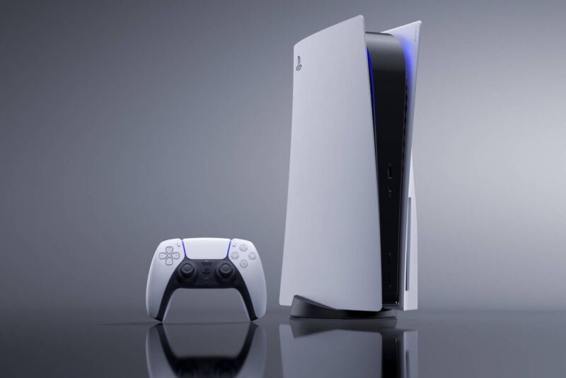
Microsoft wins battle with Sony as UK reverses finding on Activision merger - Ars Technica

Enlarge / Sony's PlayStation 5. Sony UK regulators reviewing Microsoft's proposed acquisition of Activision Blizzard reverse...

Postingan Populer